In a world where sustainability has become an important aspect in our daily lives it has become more and more important for individuals to become educated on daily consumption habits and their ecological footprint. Only when our individual contributions add up can we truly make a difference in building a more sustainable future. CEO Olivia Pedersen and CTO Leif Schjeide created Sustaio, a mobile application that helps users understand the impact of their consumption habits and aim towards a more sustainable lifestyle through learning modules and progress tracking.
With Sustaio's existing user interface it was difficult for Sustaio to become a differentiator in the market. The current design needed an overall stronger visual hierarchy as well as have the ability to minimize cognitive load on the screen, as much of the content on the screen was text-heavy. Sustaio needed a better way for the user to digest all of its information. As for the branding and colors, Sustaio struggled to find a cohesive, user-friendly, yet bold stance in its overall color scheme.
In short, Sustaio needed an aesthetically pleasing user interface that would showcase strong visual hierarchy for screen content, the ability to minimize cognitive load and to progressively disclose information as the user progresses.
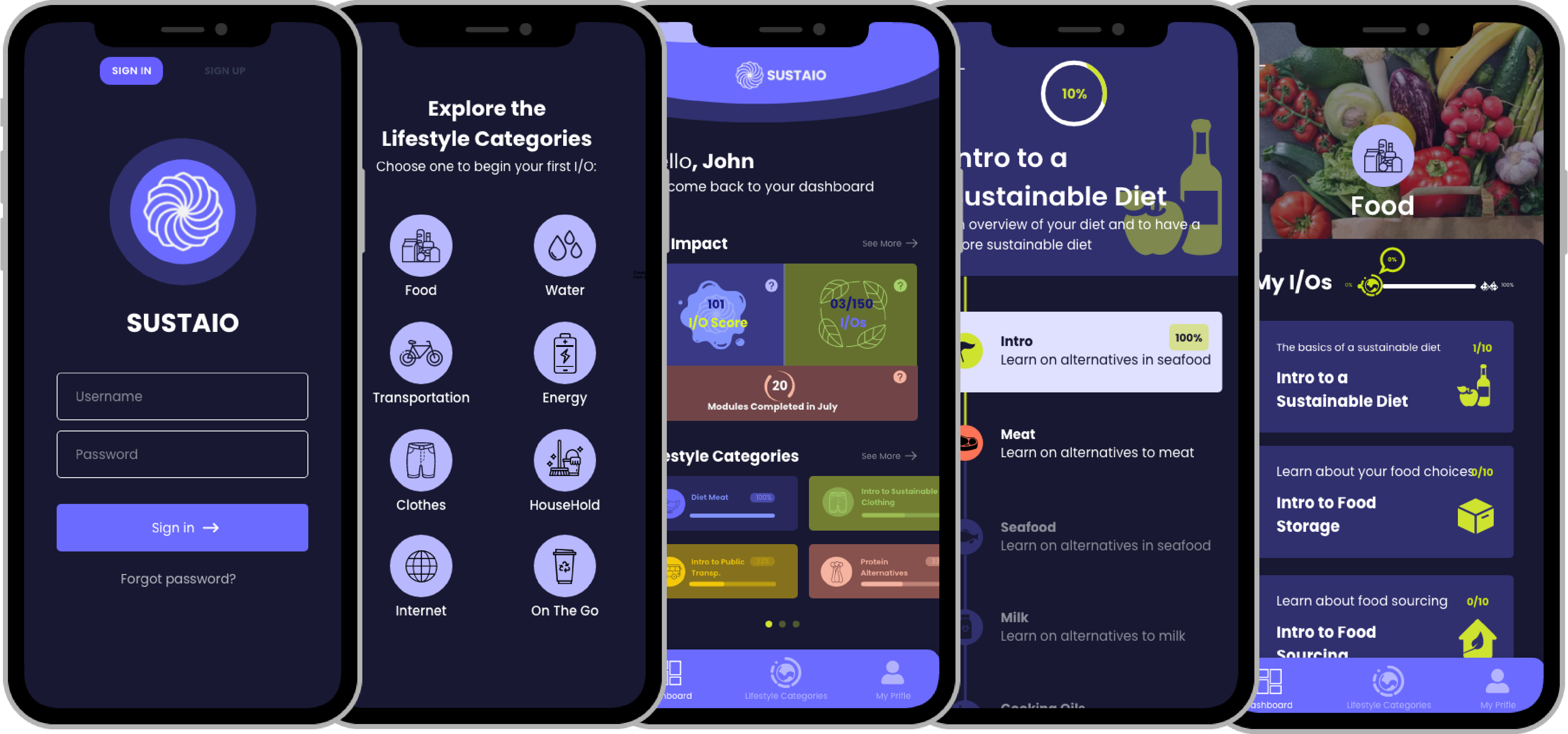
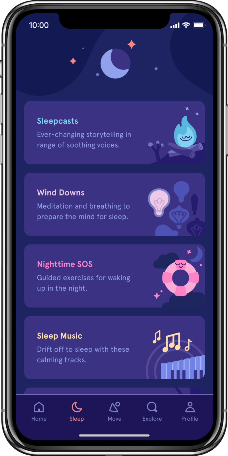
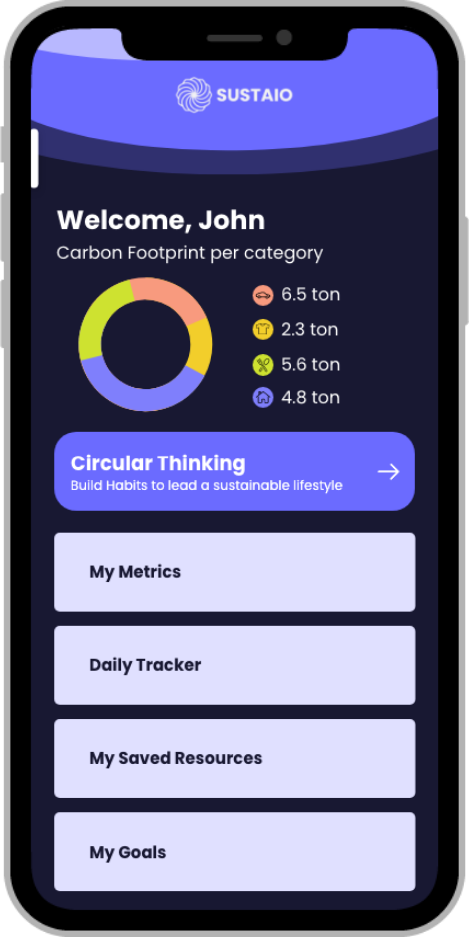
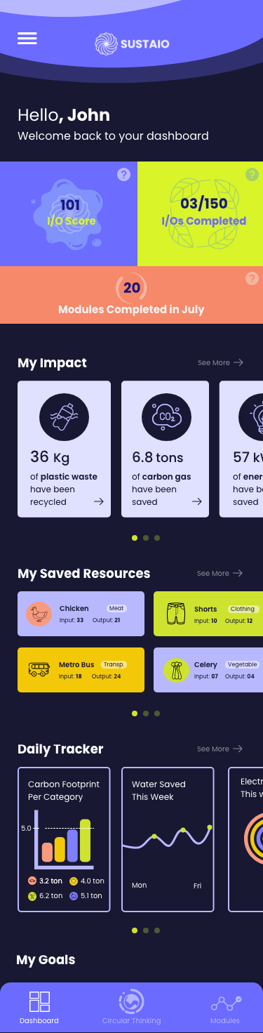
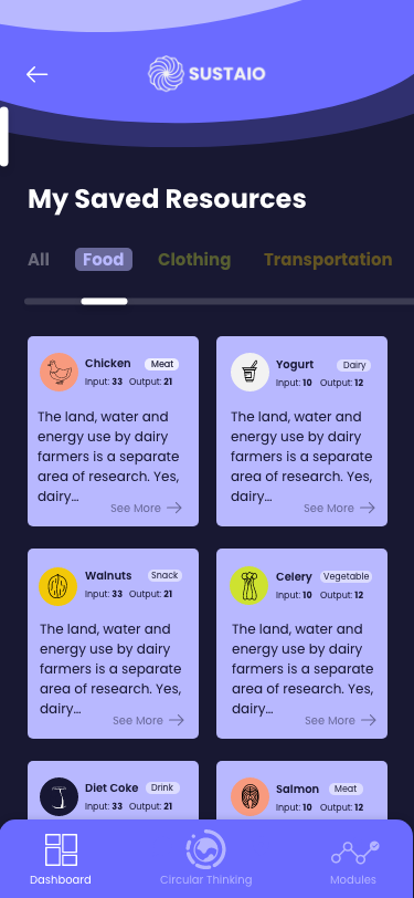
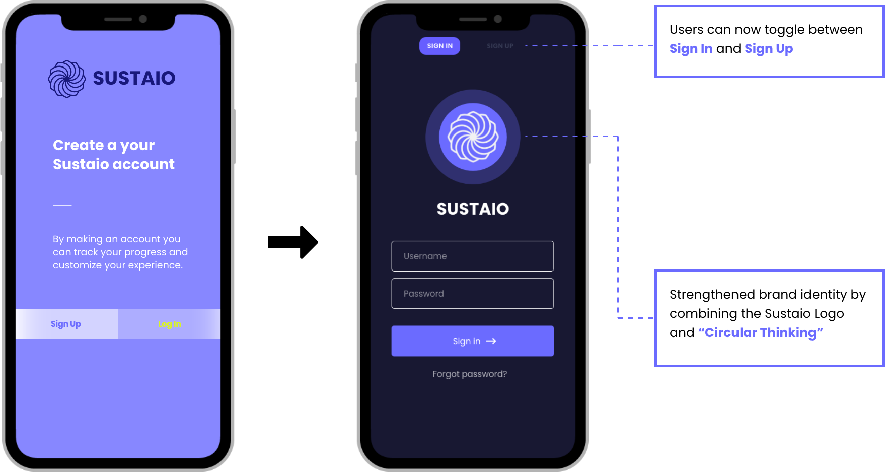
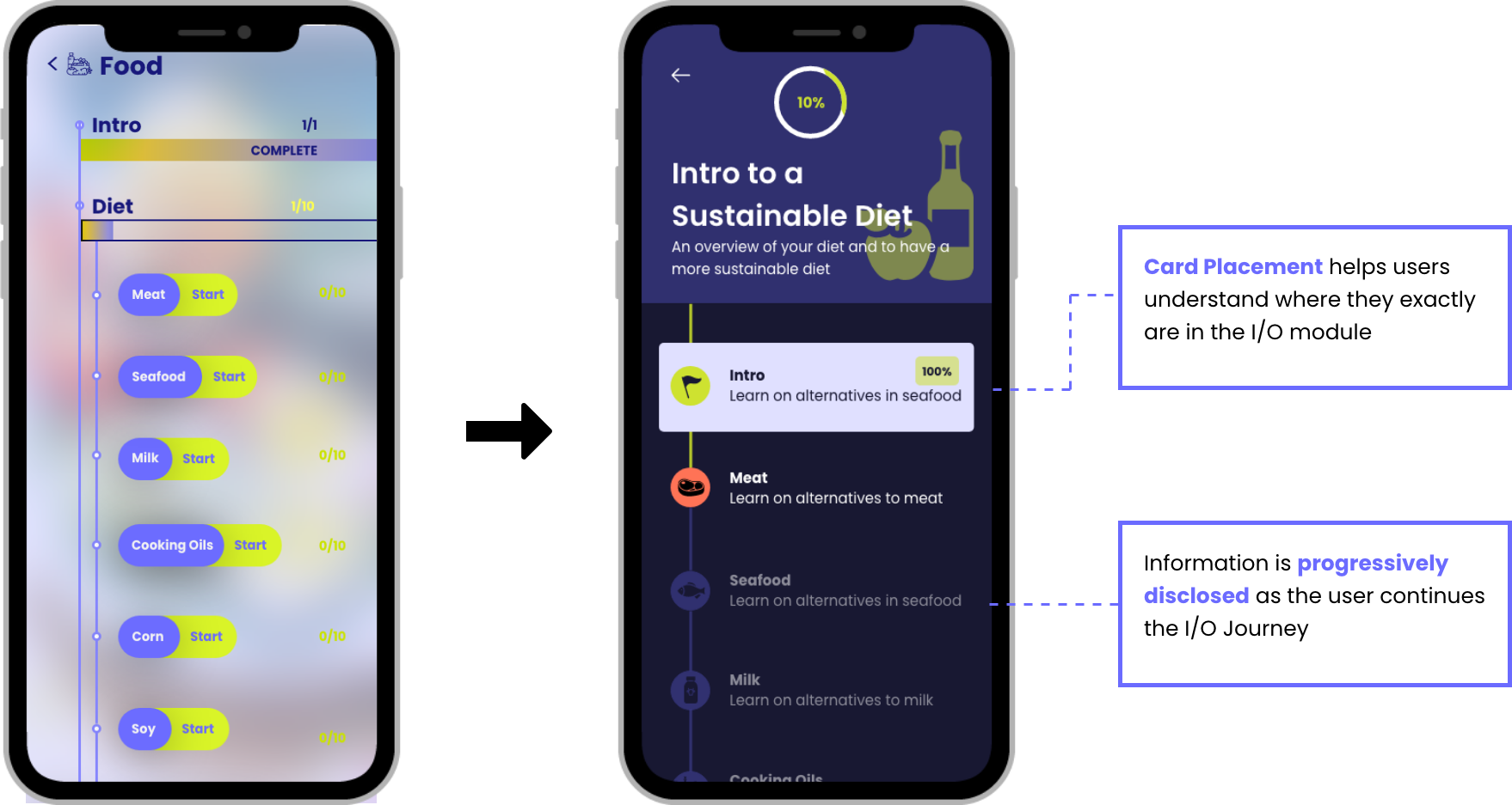
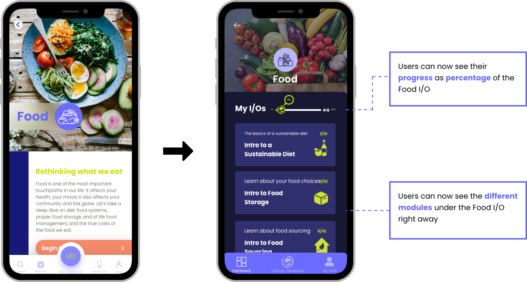
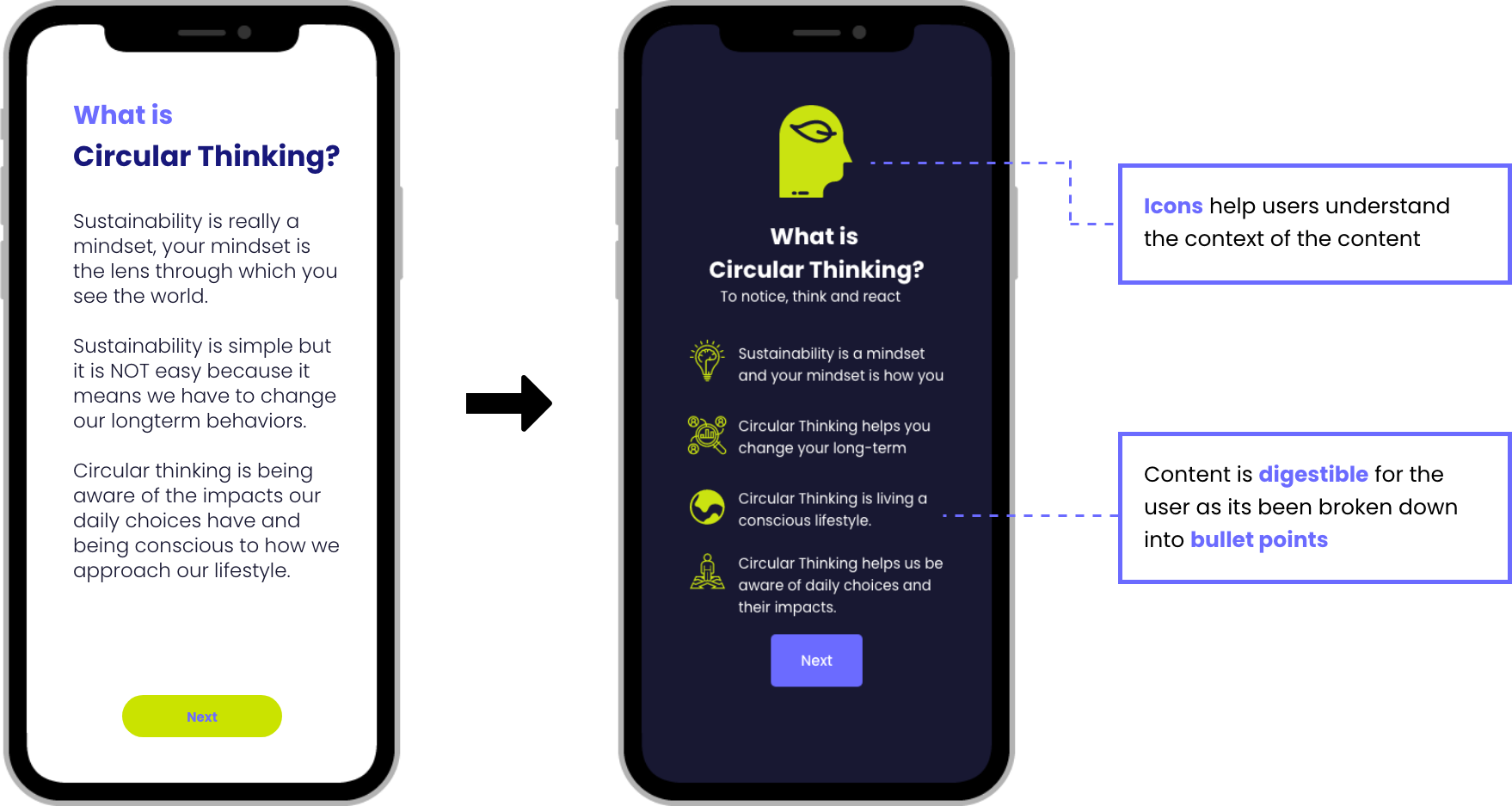
Sustaio now boasts a dark themed, bold user interface that showcases strong information hierarchy and the ability to progressively disclose information as the user progresses via the app. This provides the user with an intuitive, user friendly experience as well as instill excitement and gamification for the user to come back to the app. Users are able to recognize Sustaio's bold identity through its color scheme, and be able to easily use the application from knowing how to use other popular applications. Compared to its competitors in the market, Sustaio, with its new and sleek design, helps shorten the learning curve of understanding how to use the application, so more time can be spent on learning and consuming/digesting content.

Before getting our hands dirty, we agreed upon a design process that helped guide us throughout the project. We first started with a kick off meeting and then researched the competitors in the market for competitive advantages and specs. Then we proceeded to ideate design directions via mood-boards and style tiles and tested them for user feedback. We took the user data and iterated our initial designs based on feedback. We then entered a second round of testing. Although we received more feedback from users, due to time constraints we had to move past the second iteration phase and deliver our final designs to adhere to the project scope.
Once we understood the app's usability and primary user flows, we proceeded to conduct research on the sustainability app market and its main competitors. We noticed that most of the existing sustainability applications had similar areas of improvement when it came to screen content layout, cognitive load and managing the user's progress and growth. From the competitors below, we were able to conclude on three main insights that would help Sustaio achieve its competitive advantage in the market.
Once we understood the app's usability and primary user flows, we proceeded to conduct research on the sustainability app market and its main competitors. We noticed that most of the existing sustainability applications had similar areas of improvement when it came to screen content layout, cognitive load and managing the user's progress and growth. From the competitors below, we were able to conclude on three main insights that would help Sustaio achieve its competitive advantage in the market.

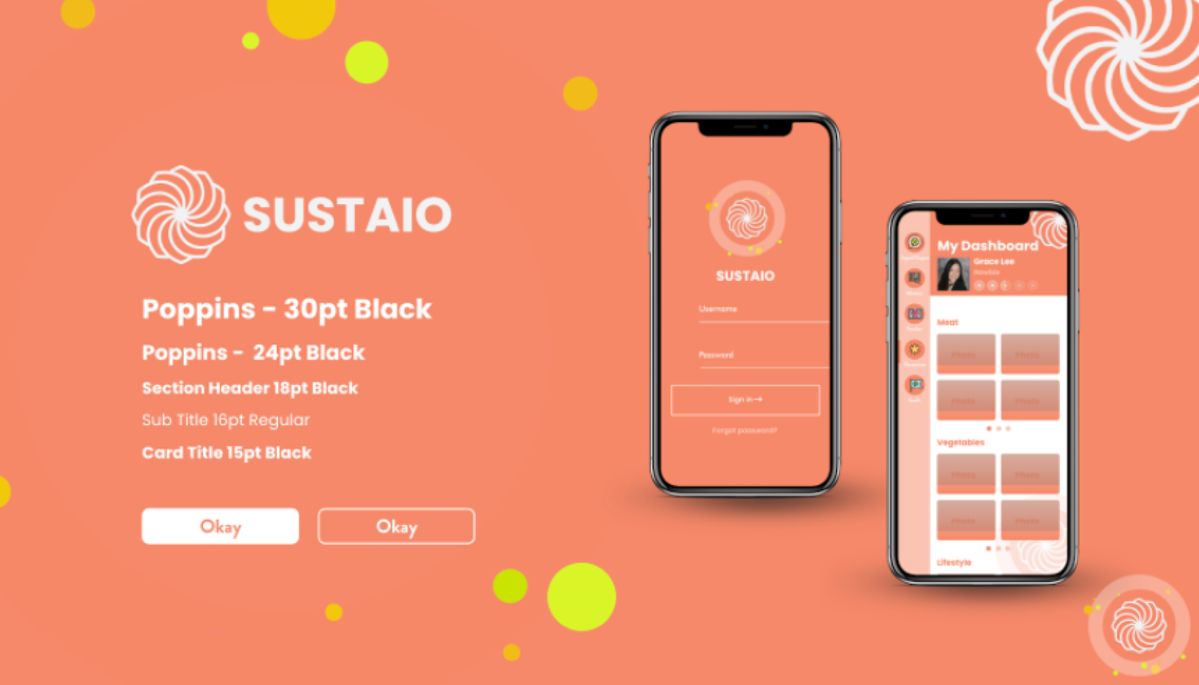
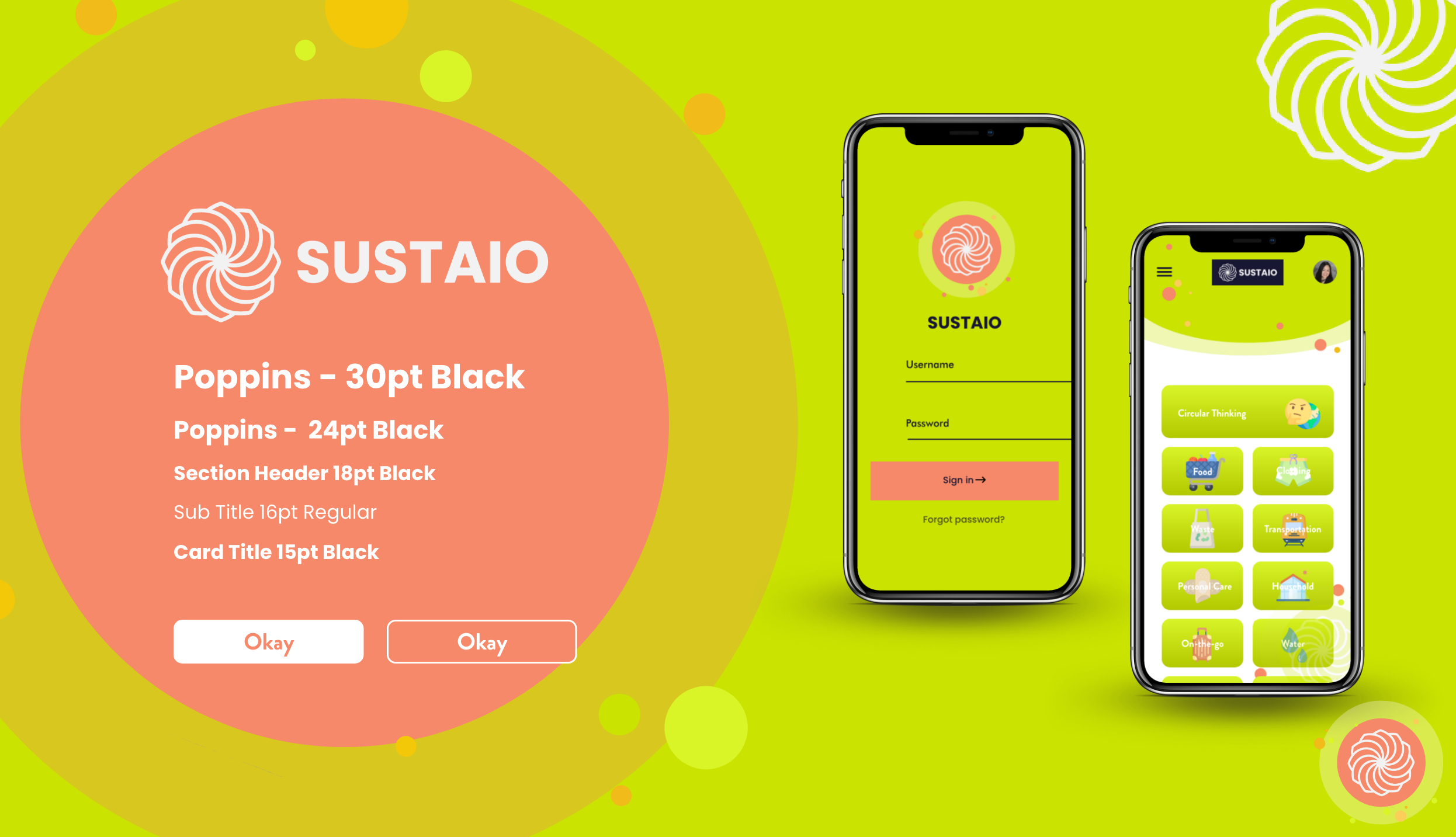
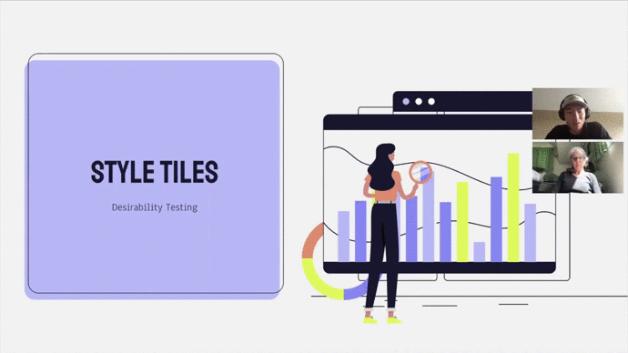
Once we concluded our research, we each designed three divergent style tiles to provide our client with different options on setting on a design direction. Sustaio although already had fixed design components such as the color scheme, font and logo, but it was our job to apply our insights gained from our market research to design style tiles that would resonate the cause of Sustainability.
It was important for me to showcase an aesthetically pleasing UI that would ultimately provide a glimpse of what the application could look like to the user. For each style tile, I strived to show a diversity of UX and UI patterns to see what the user preferred during testing. As for branding, I decided to experiment with different color schemes and explore the different moods/emotions they would evoke.
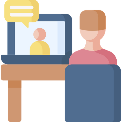
Our list of testers were provided by Olivia and Leif that consisted of potential end-users and subject matter experts of sustainability as this was important for us to test with a pool of users who are able to provide concrete and beneficial feedback. Our approach was to use Zoom Meetings due to COVID-19 precautious measures and conduct a desirability test, giving users the freedom to express their preferences.
.png)
Below are GIFs I created from user testing to show a glimpse of the experience. We tested all 9 of our style tiles against a list of chosen adjectives for the user to choose from and describe how they felt or saw. It was interesting to see the different responses we received as well as the reasons why users felt a certain way. With all the data that was collected, we decided to layout all of our responses and create affinity diagrams in Miro-board to find valuable insights.
.gif)
Risky Color Connotations
Certain Color Combinations can be risky due to already preconceived correlations set by society
Generally Accepted Branding
The interface's branding and color scheme should speak to a wider, more general audience
.png)
Intuitive Experience
Users want a simple, user-friendly experience and be able to use the app from using other popular apps
After presenting our findings and discussing with our client, we realized there were a lot of design elements our clients wanted to use from each unique style tile, but wasn't entirely confident in settling down with a single design direction.
This sparked more conversation with the client in how Sustaio can rebrand the theme of sustainability, while preserving its integrity as a sustainability focused application. Understanding what worked in testing, while looking back at our research and discussing with our client, we explored different avenues in how we could set on a design direction for Sustaio.
Our clients mentioned they really enjoy the application Headspace's dark theme and how it was used effectively to create a user interface and branding that was fun, engaging, and empowering.
Drawing from this inspiration, we decided to proceed with a dark theme to provide boldness as well as be a differentiator in the market as no other competitor seemed to use a dark theme for its main interface. Although the data could not statistically support this direction, Olivia and Leif were confident in moving forward.
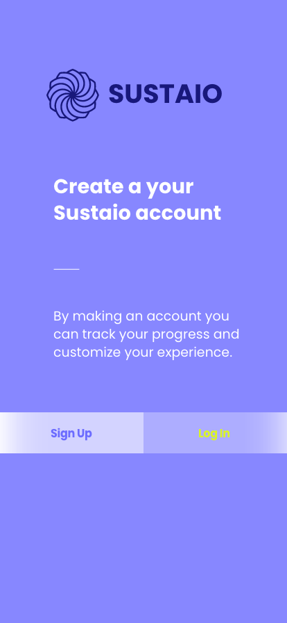
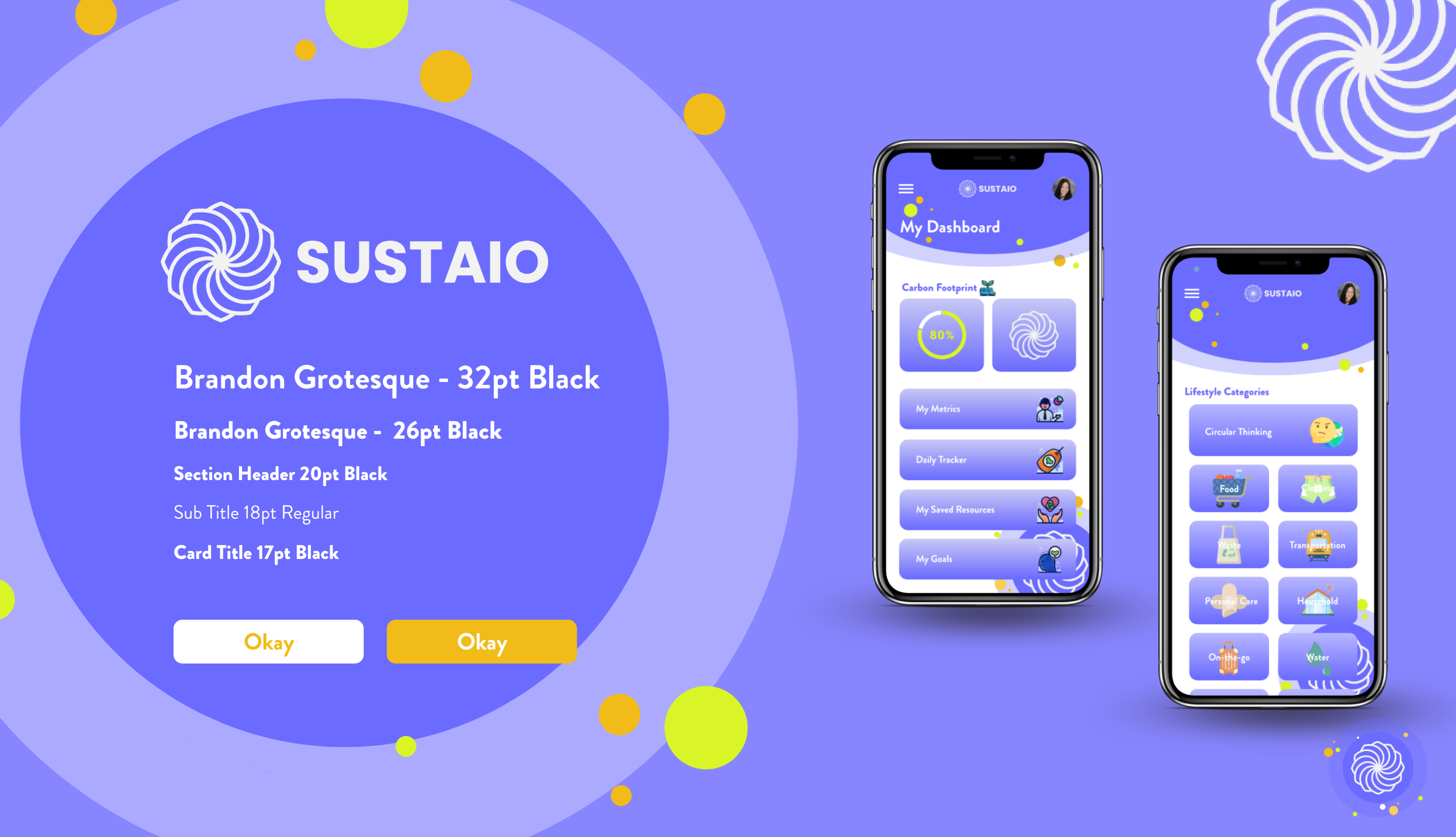
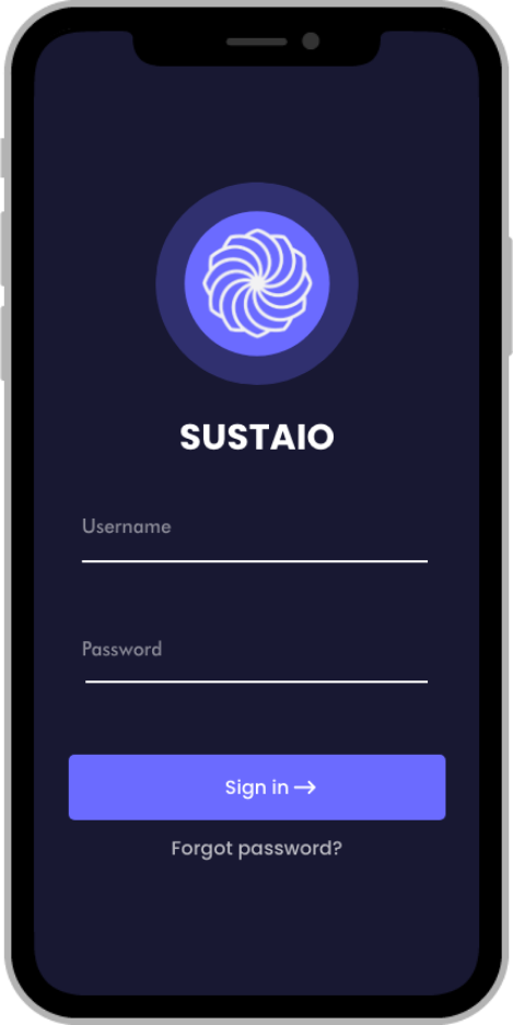
Using Sustaio's primary and secondary lavender colors, I created a color scheme that helped bring Sustaio an identity that was clean, sleek and a look that took sustainability serious. I also added a new logo for Sustaio that would help emphasize Sustaio's new bold identity.
Before designing our initial hi-fidelity designs, we decided on 4 design principles that would help guide our team in making human-centered decisions during the design process. When faced with uncertainty, we referred back to these design principles to help steer us in the right direction.
Tone, diction and style of language should be used to create an enjoyable experience for the user.
.png)
Sustaio takes a new bold identity, which helps plant the seed of curiosity for users to explore the topic of sustainability.
.png)
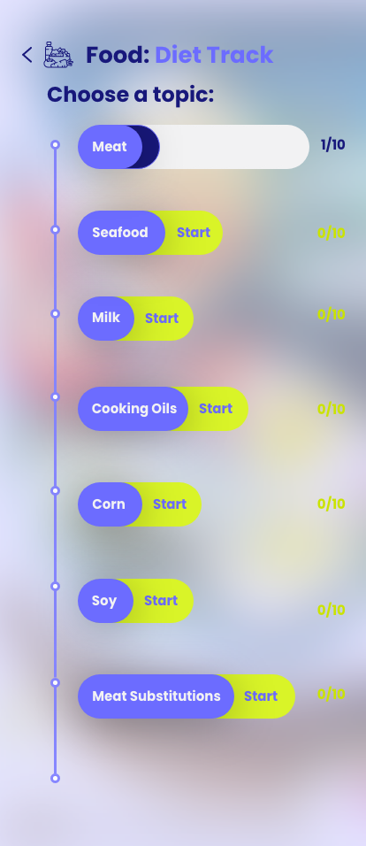
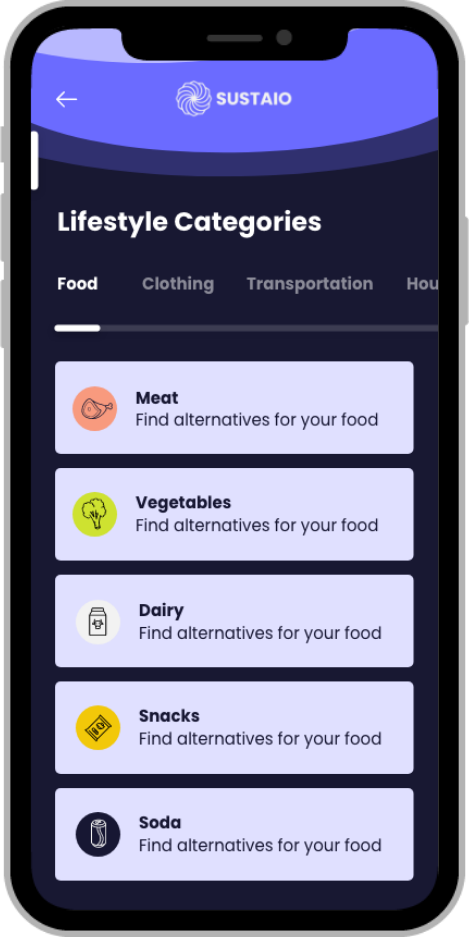
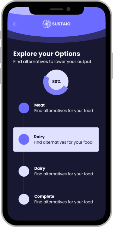
Progressively disclose information on the screen to save cognitive load. Slowly unfold more content as the user progresses via the app.
.png)
Sustaio should be intuitive and easy to use. Users should know how to use the app from using other popular apps.
For the initial designs, I focused on making sure the branding for Sustaio and the theme of Sustainability resonated through the dark theme and its lavender colors. The next priorities were to design a more simplified version of the dashboard and an intuitive visual hierarchy that would help users digest information on the screen quickly and not get overwhelmed. My first prototype highlighted two main user flows of the application: "Login/Signing up" and "Completing a learning module." The prototype entered user testing and four main insights were concluded.
Emphasize
Instant Gratification
.png)
Completion messages and pop-up notifications make the user feel rewarded.
Humanize
Big Numbers
.png)
Complicated data should be easily understood and read as insights.
Personalize
Language
Move away from industry terms like "My Metrics" and instead use "My Impact".
Story-tell
with Colors and Imagery
Use Sustaio's colors along with images to resonate the theme of sustainability.
As we continued our designs, we realized there were quite a few pieces we missed in terms of understanding the app's functionality. By not fully understanding the app's screen to screen flows, we struggled in continuing to design and expand our screens. The more we designed, the more questions and doubts we faced about the actual usability.
As a result, we created some aesthetically pleasing screens, but its purpose was quite questionable. As I continued to design, I realized I was making a lot of core UX decisions that were difficult to make without a strong set of UX wireframes. Without a clear direction, it proved difficult to continue.
With more questions than answers, we knew we needed to step back. We had to understand the screen to screen flows of the application. By mentioning we either need a strong set of wireframes or process flows that would guide us with our designs, I was able to spark a conversation with my teammates in how to move forward.
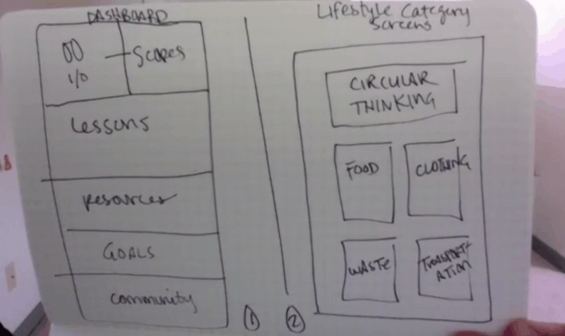
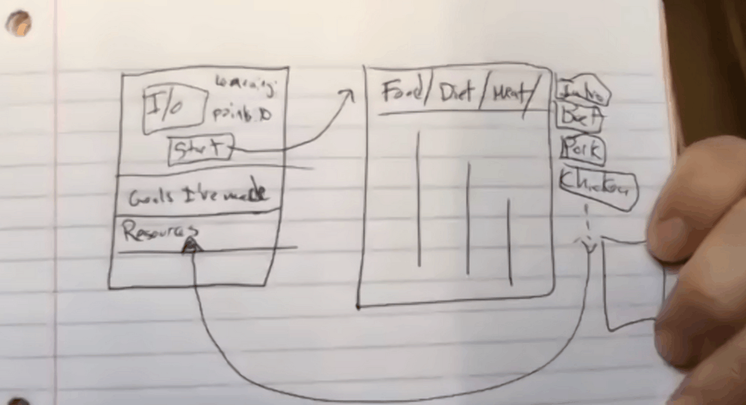
Going through similar issues in her design, my teammate Celine Fucci, initiated to build the main process flows of the application. When going over the flows and collaborating together, we gained a better understanding of how an end-user would use the application from a screen to screen perspective. Although we still had to make some important UX decisions when it came to our wireframes, we were able to pave the way for the rest of our UI designs. This gave us the confidence to branch off and continue our designs for our updated high-fidelity screens.
.png)
.png)
.png)
Having a better understanding of the app's flows helped me to refine my designs for each screen that was already designed. The refinements for each screen made more sense as I was able to design imagining what it would be like to use the app from an end user's perspective. Below are some of the major refinements that were highlighted as part of the final designs.
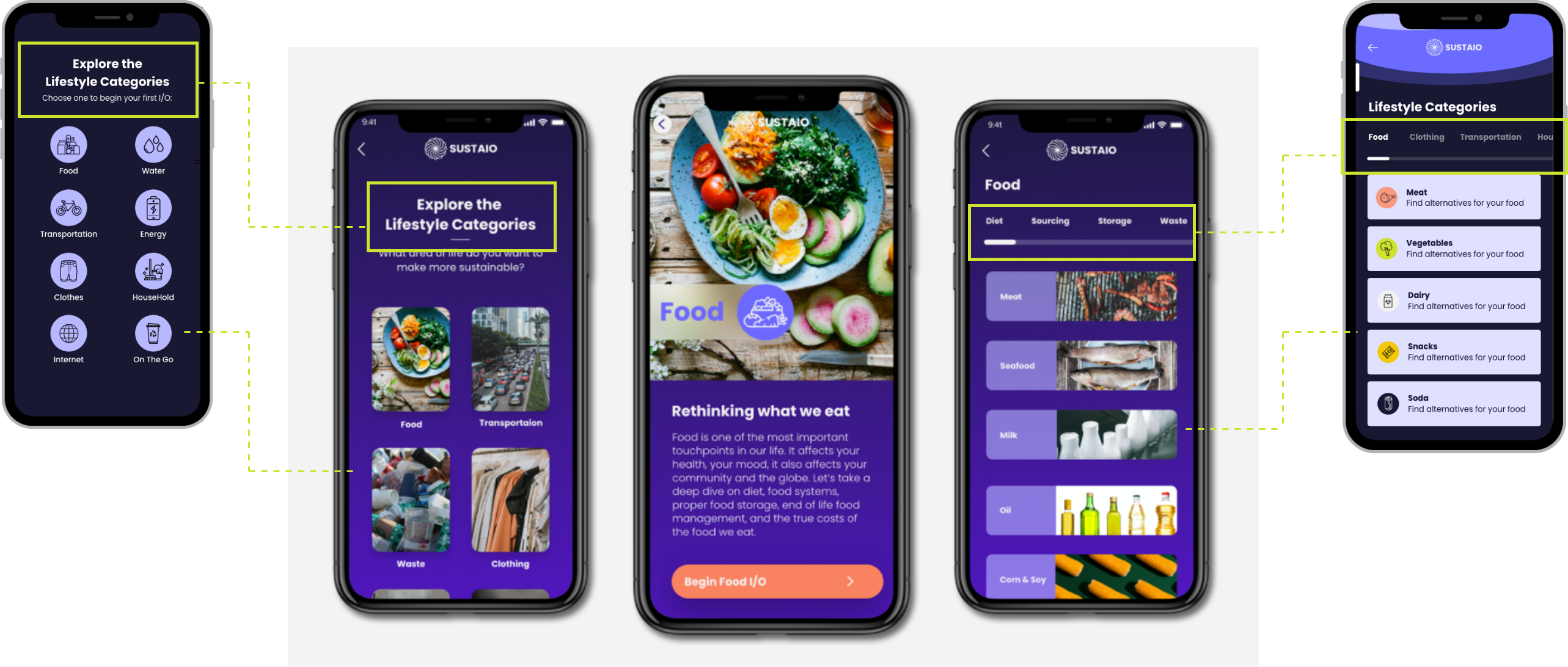
Breaking down the application into main user flows and understanding how each user flow works from a screen to screen perspective was key to finalizing our designs and building our final prototype. In retrospect, although there were a lot of screens that needed to be designed, the application itself can actually be broken down into a couple of main user flows.
.gif)
.gif)
.gif)
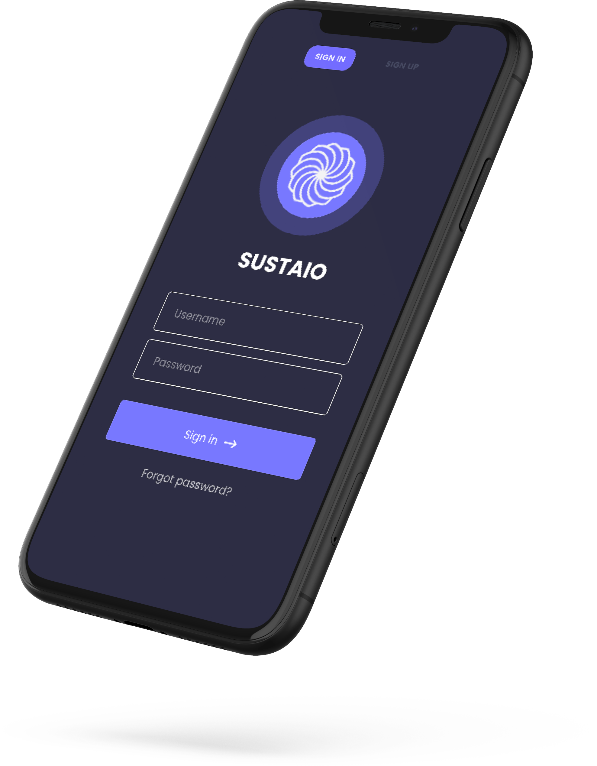
Couple of weeks later after delivering my final designs, I was fulfilled to see some of my design decisions be incorporated into Sustaio's updated prototype. The mockup below was used in Sustaio's crowdfunding campaign, which showcased an updated prototype with some of my design components. The mockup was used in the campaign to explain some of its key features such as navigation and its digestible screen layout. Although not all of my designs were used, I was pleased to see some key design decisions be used to strengthen the Sustaio prototype. The updated prototype was able to help Sustaio garner $35,000+ as of April, 2021, helping Sustaio reach a stage for development.
Users mentioned they would have liked a more personalized onboarding experience. Onboarding should ask more about the user's background and use the data to calculate the user's Sustainability IQ as well as daily consumption levels.
Through testing and research, we found having a bottom navigation bar helps the user easily access the main segments of the application. This will need more testing as Sustaio continues to build the application.
Incorporating fun interactions in the little things such as completing a module in the app, signing up or earning points help create a more welcoming, positive environment for the user.
UX/UI design is not just about designing aesthetically pleasing screens, but making them functional and practical to use for the end-user. I realized slowing down and having a concrete understanding of the app's screen to screen flow would've saved us time in the long run as it would've supported a more seamless design process down the road. This project helped me strengthen my risks and impacts of decision making during the design process as well as quickly learning to adjust when things don't go smooth.
We were naive to believe we had everything we needed to perform our roles. In reality a lot of pieces were missing. Without having a strong foundation of UX work or user flows to guide us with our UI designs, we spent a lot of time designing without direction or end goal. Running out of time, we championed through by taking a step back and collaborating with each other to understand the app's usability. In retrospect, I would've opened a discussion to adjust the scope of the project to maximize quality within our given timeline.
We ran into some critical roadblocks and uncertainties as the project progressed. Instead of allowing fear to drive our decision-making when facing the situation on our own, looking back, it would have been more effective if we reached out and involved the client with daily status checks via email with questions. This would've helped create a tighter bond with the client as well as provide transparency to roadblocks as well as high priority issues.