Recent studies show that America is experiencing its lowest rate of volunteerism in the last two decades. Despite this fact, most people care about making a difference and giving back to their communities, but they either don’t have the time or find it to be a daunting commitment. The primary target audience was young, busy professionals of the ages 20-35 who have the lowest rates of volunteerism and need extra motivation to get involved.
We were initially tasked to design an aesthetically pleasing user interface for Voluntopia that would target young busy professionals. As we continued to work on the project; however, we realized we needed to make some key UX decisions along the way to achieve our solution. Towards the end of the project, although we faced some time constraint issues, we took the time to rationalize and readjust our initial wireframes, which was a key moment in our design process that helped us reach a stronger end product.
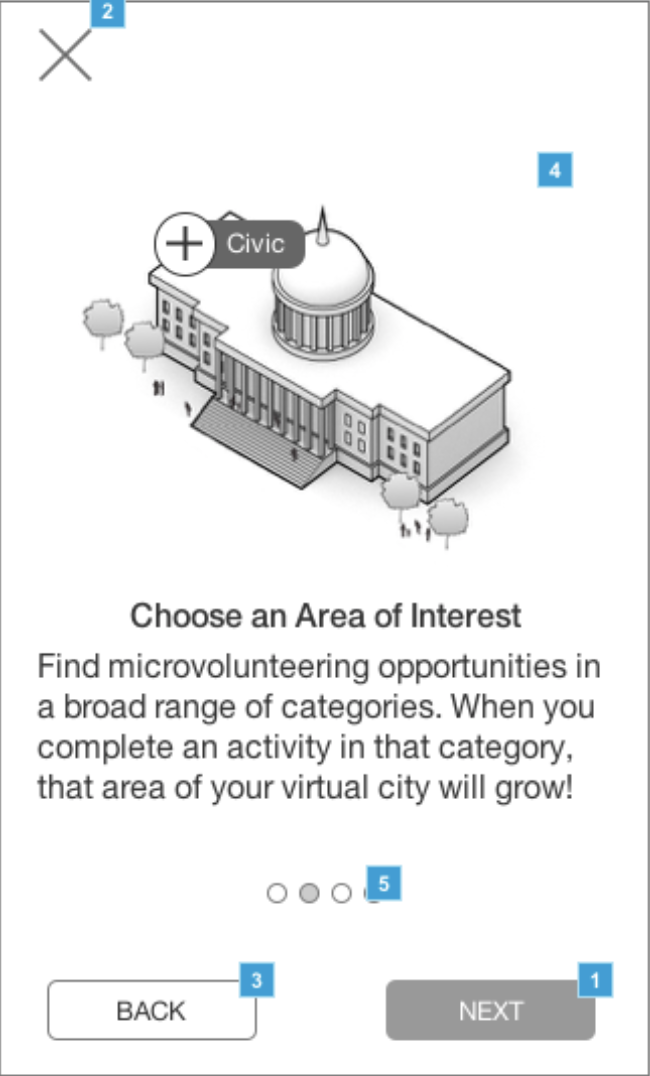
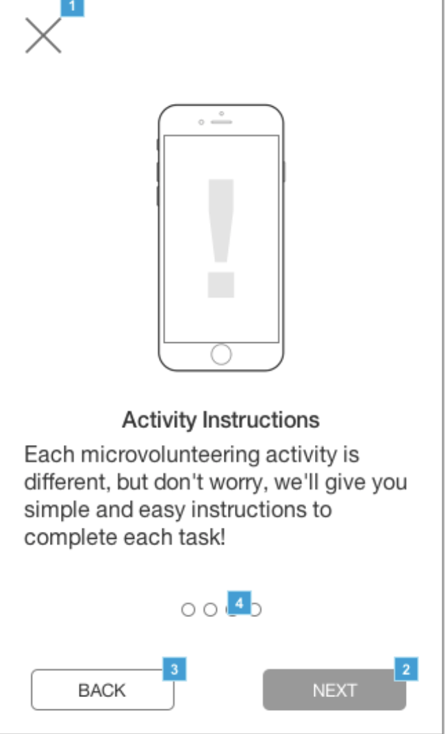
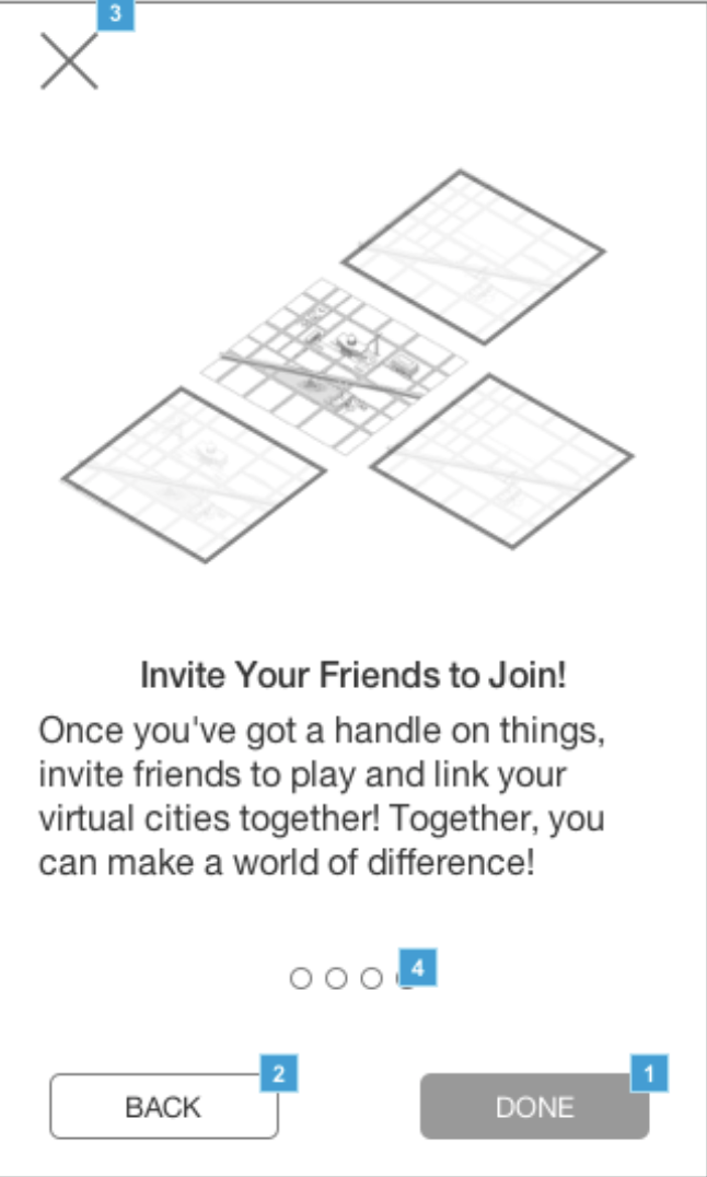
Our solution for Voluntopia can be broken down into four key sections.
1. Green & Gold Theme
Green stands for balance, rebirth, prosperity and progress while Gold is associated with love, compassion, courage and passion. By combining these color choices, I aimed to create a branding that is welcoming, yet empowering.
2. Re-Design of Wireframes
Based on user testing feedback and agreement from stakeholders, the initial wireframes were re-solutionized to be more intuitive and less distracting
3. Scalable Point System & Gamification
Users can earn points via gamification and turn them into real-life rewards. A future recommendation would be to solidify the app’s point system concept.
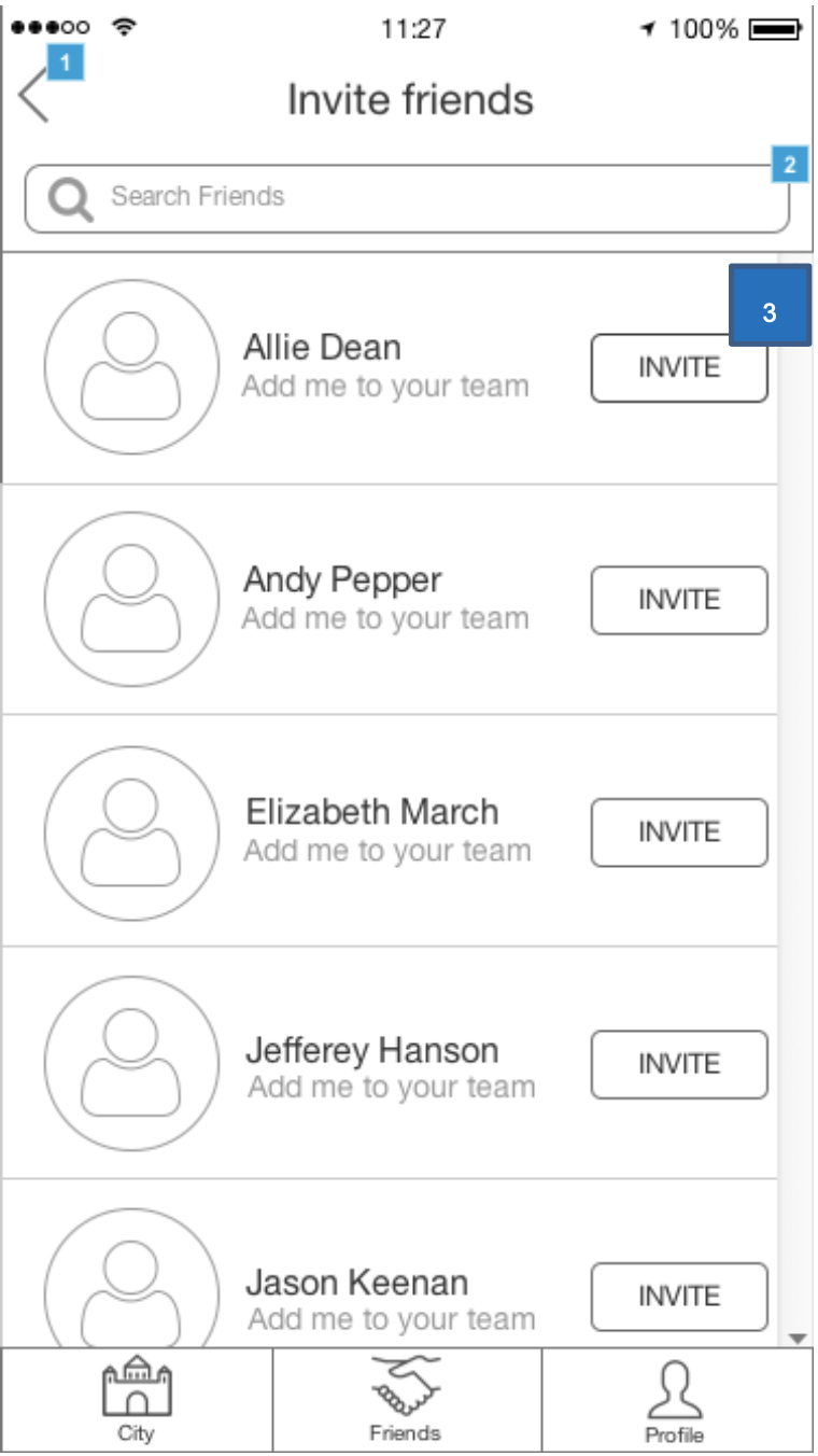
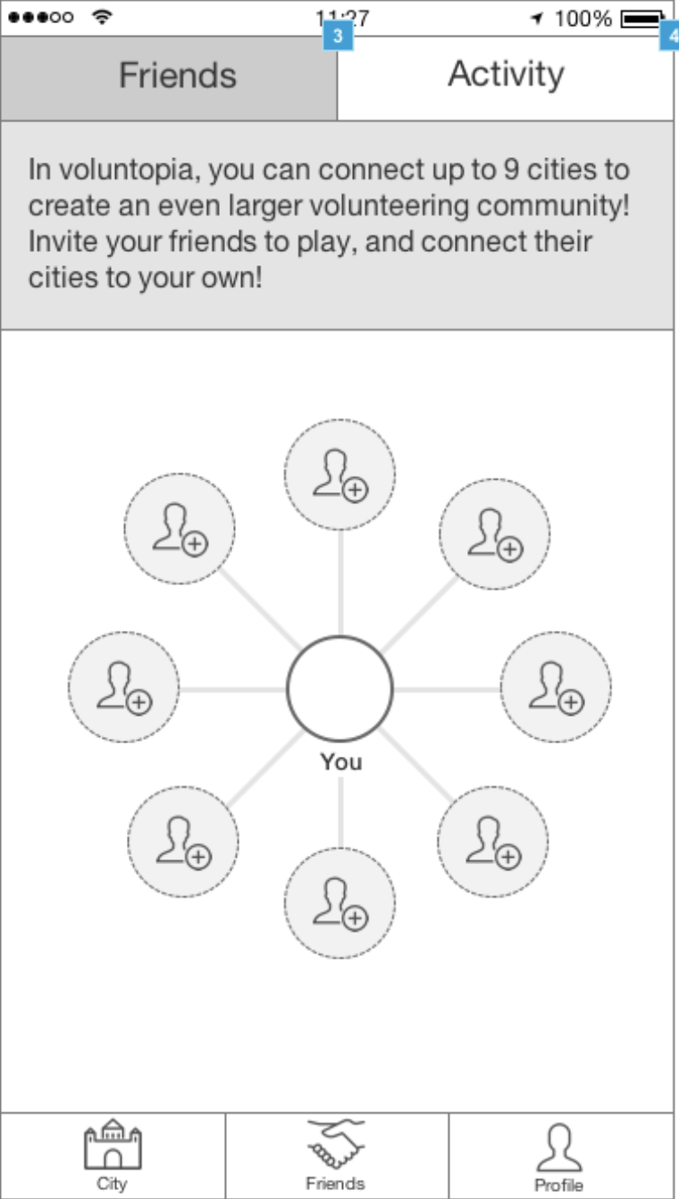
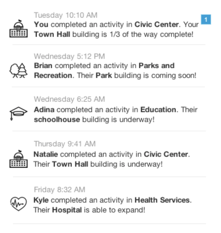
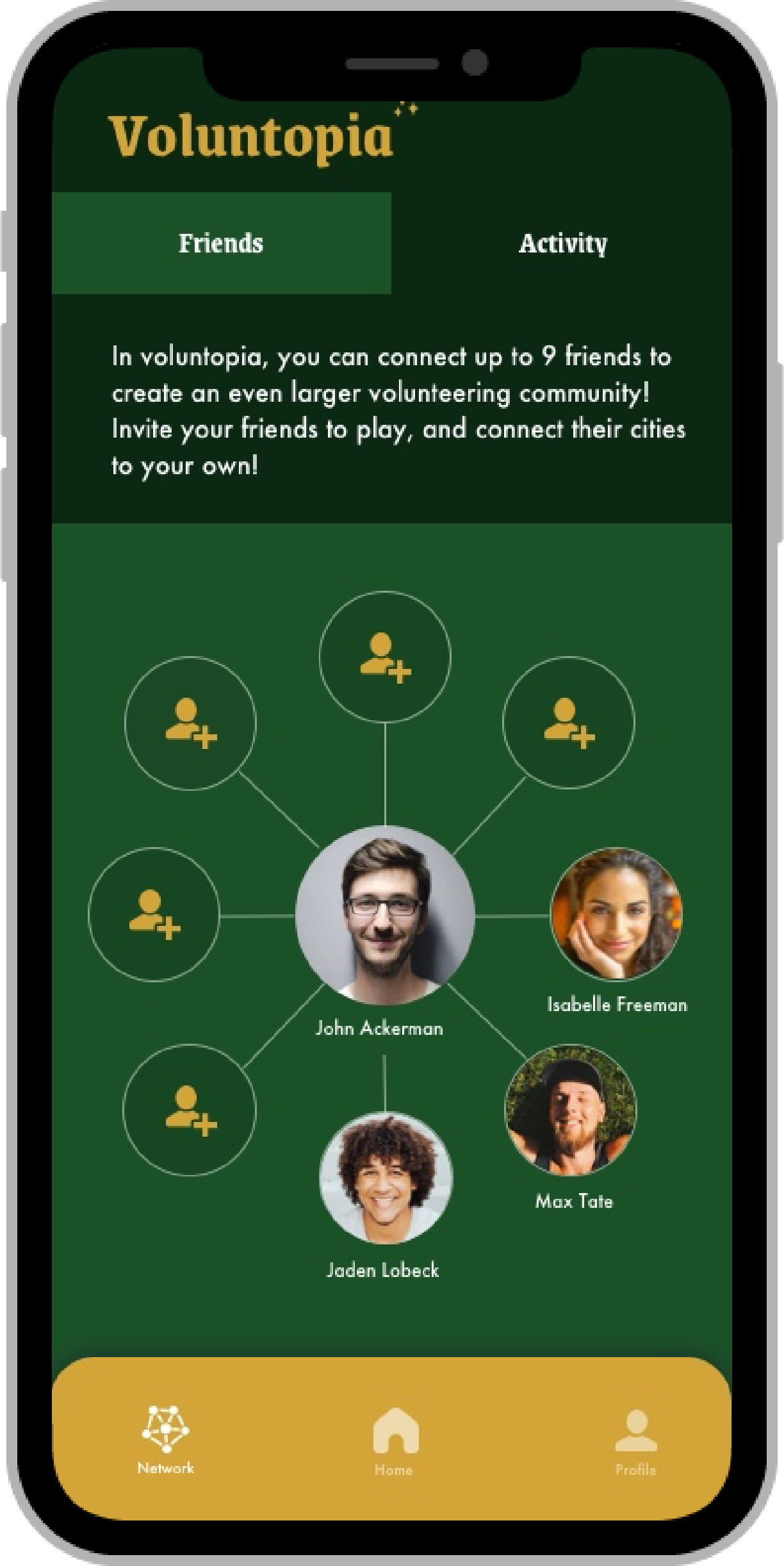
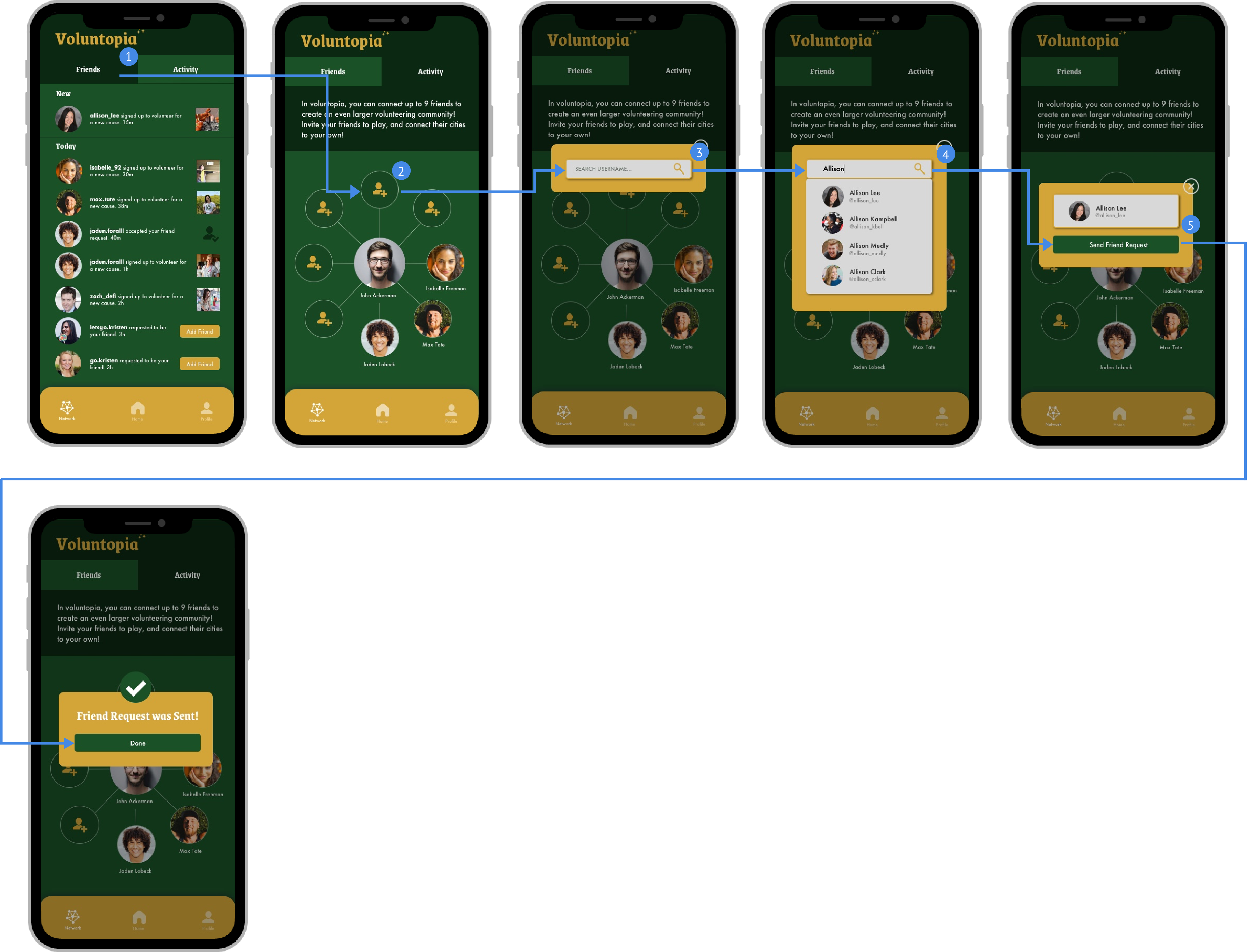
4. Social Component Integration
Users can earn points via gamification and turn them into real-life rewards. A future recommendation would be to solidify the app’s point system concept.
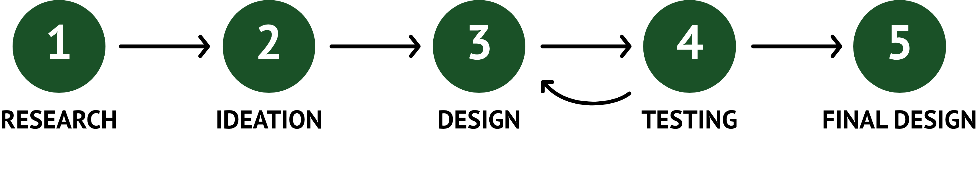
Before diving into the project it was important for our team to set a design approach to help guide us throughout the project. Although initially set, we were ready to adjust our process according to how the project progressed. It became apparent we had to pivot our approach towards the end of the project due to the lack of time we were facing. As a result, we prioritized delivering the expected number of designed screens more than focusing on iterations as we wanted to make sure we met the deliverable expectation.
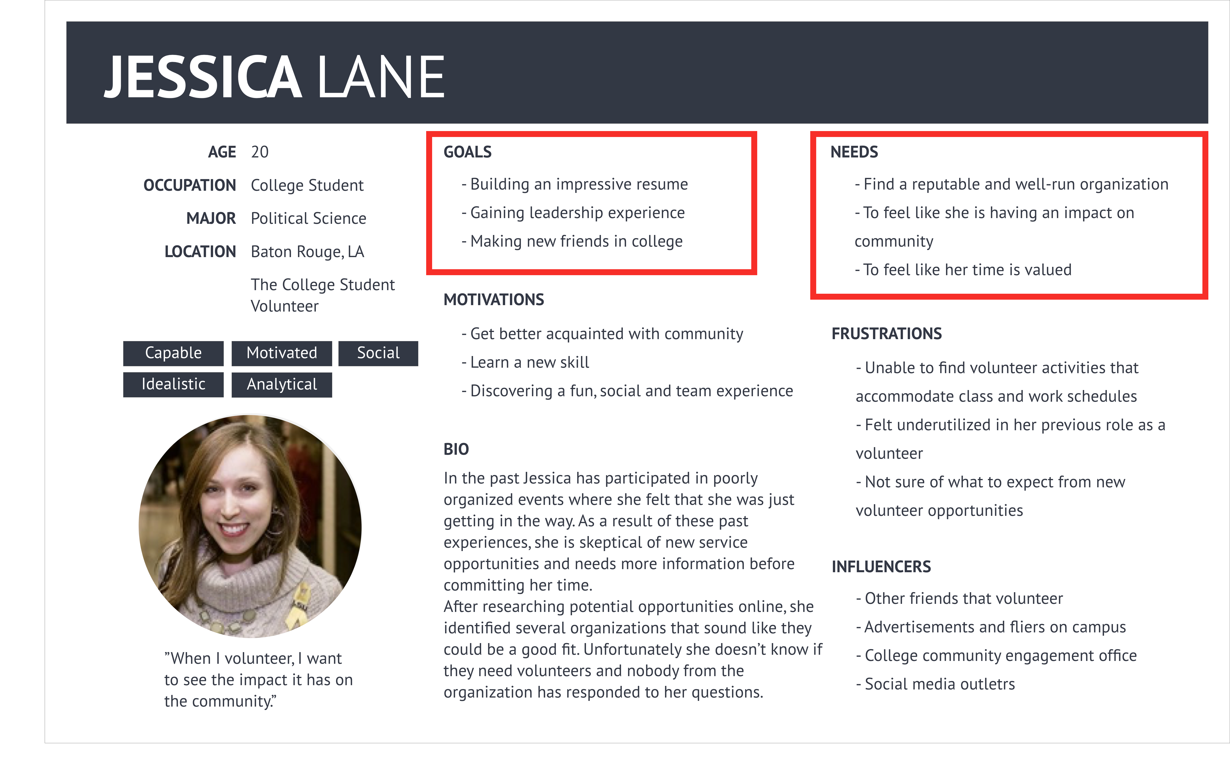
To understand our audience better, we took a look at the projects persona as a starting point before jumping straight into designing moodboards and style tiles. Our user persona, Jessica Lane is a young busy professional who is interested in volunteering and wants to make a positive impact on the community, but her busy schedule makes it difficult for her to contribute. Breaking down the pain points, motivations and needs of our user persona helped us to aim towards a more empathetic design.
.png)
.png)
Using our user persona as context, we conducted market research on the volunteer applications currently existing. We focused on highlighting the competitive advantages of each competitor, shedding light on what made them successful. Below I simply highlighted in bold, what I believed summarized the competitor in a couple of words.
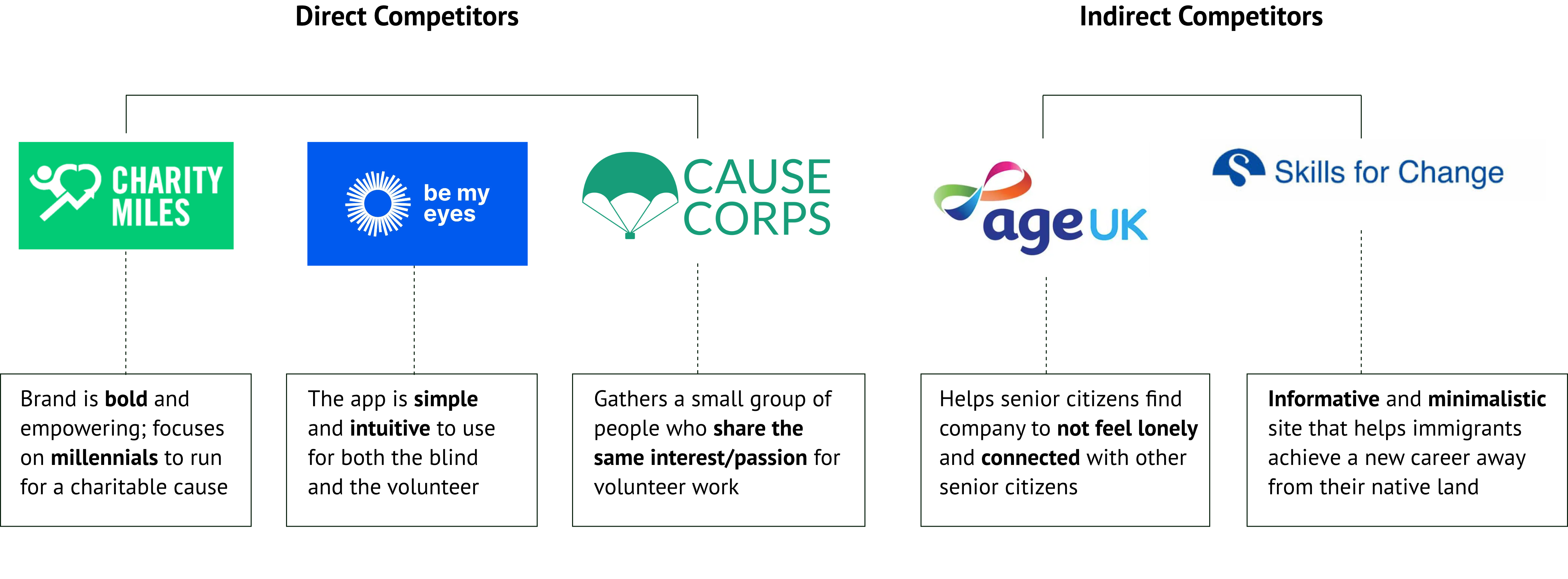
Creating the chart above helped me see the competitive advantages of each competitor from a higher level. We summarized our data and findings into four key insights, which would later be applied to our initial prototype.
.png)
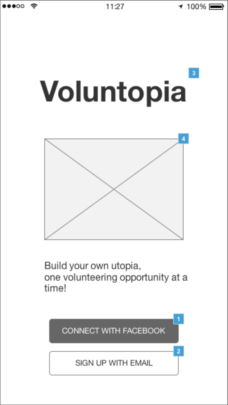
In our client resources packet, we were given a set of wireframes from the previous UX team to understand the initial wireframes for the applications. The wireframes showcased clear information architecture and content layout that was intuitive and user-friendly. To understand the app’s user flows and usability, I segregated the wireframes into 3 sections to help prioritize my design time and focus for each section.


Drawing back to my research, I was aware that many volunteering websites and mobile applications aimed for a more modern, minimalistic branding with few colors and hues. It showed a theme of volunteerism being very civil and potentially "unexciting". It was hard to find an "IT" factor.
For my moodboards, I wanted to explore different color schemes, tones and imagery to not only emphasize the app's exciting gamification nature, but to also provide a deep connection to volunteerism. Understanding our target audience being busy young professionals or millennials, I aimed for a design direction that was exciting and empowering.
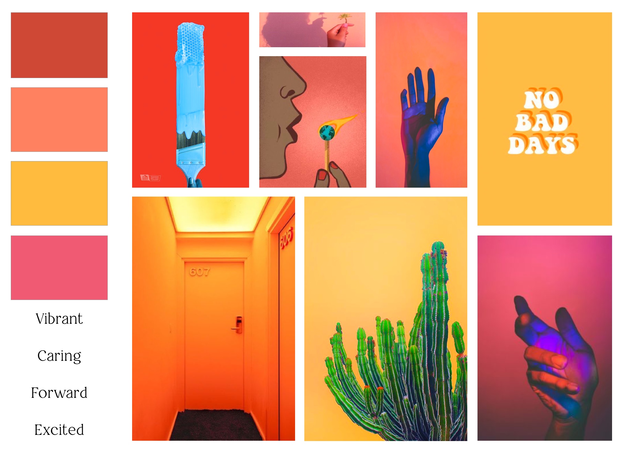
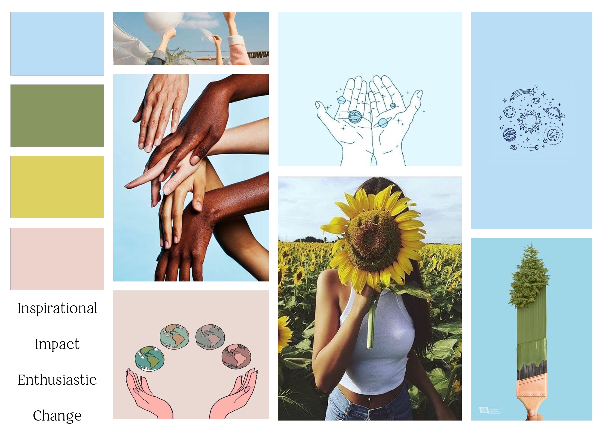
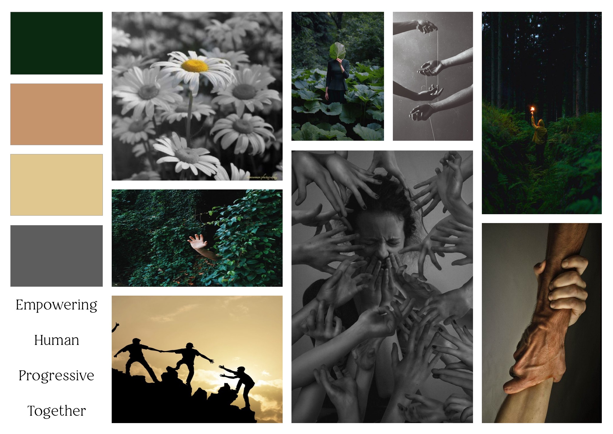
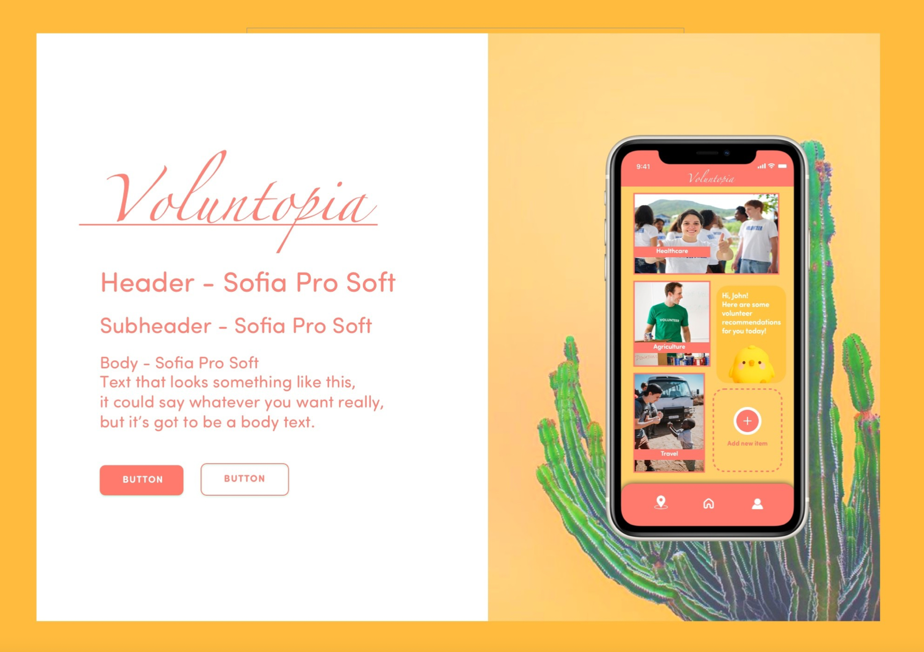
I wanted to aim for a cohesive theme with colors that are empowering versus something traditional and standard. So, I created 3 divergent moodboards that evoked various emotions, moods, colors and styles to explore Voluntopia‘s design direction. I translated these boards into style tiles that helped envision the “look” and “feel” of the user interface.
User testing was held through Zoom meetings due to COVID-19 precautious measures. Including my style tiles and my teammates, we tested a total of 9 different design directions by conducting desirability tests. To ensure each style tile was getting unbiased feedback, it was important that we had to reset the users mind by presenting a white screen before the next style tile to start with a fresh slate.

Total of 6 users

Millennials - Early 20s
.png)
Interested in Volunteering
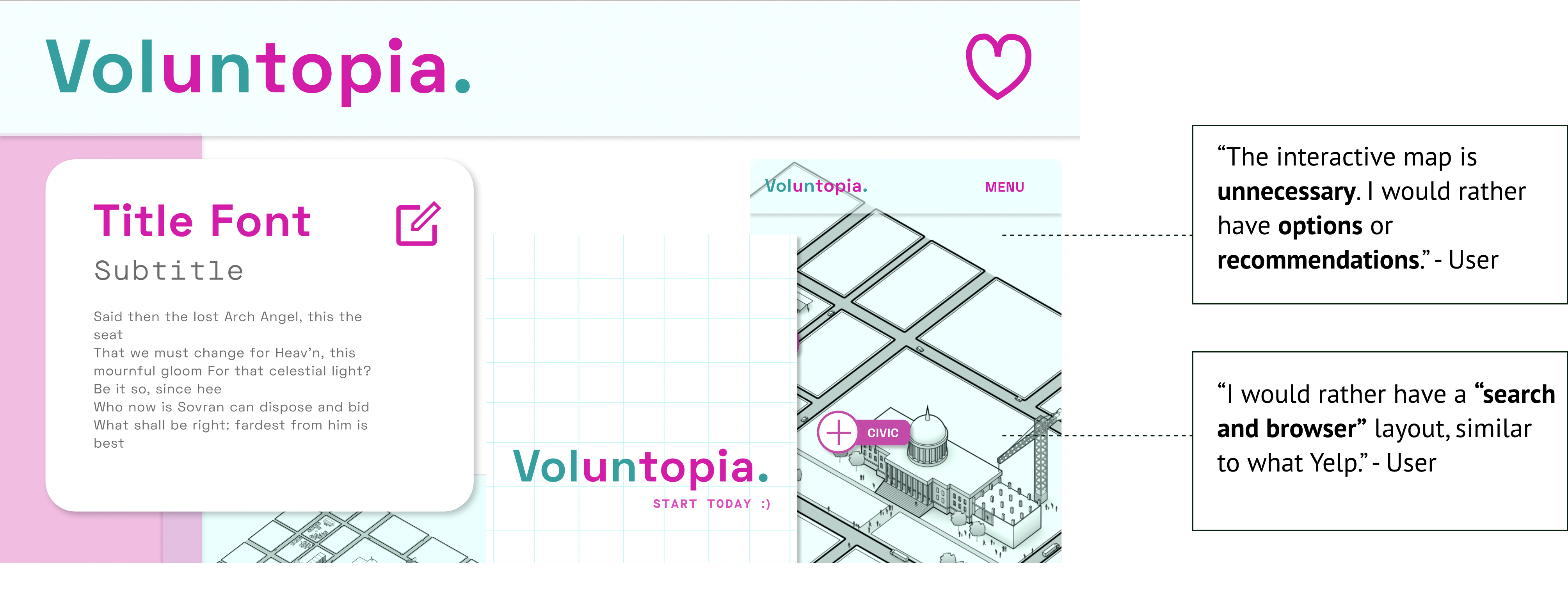
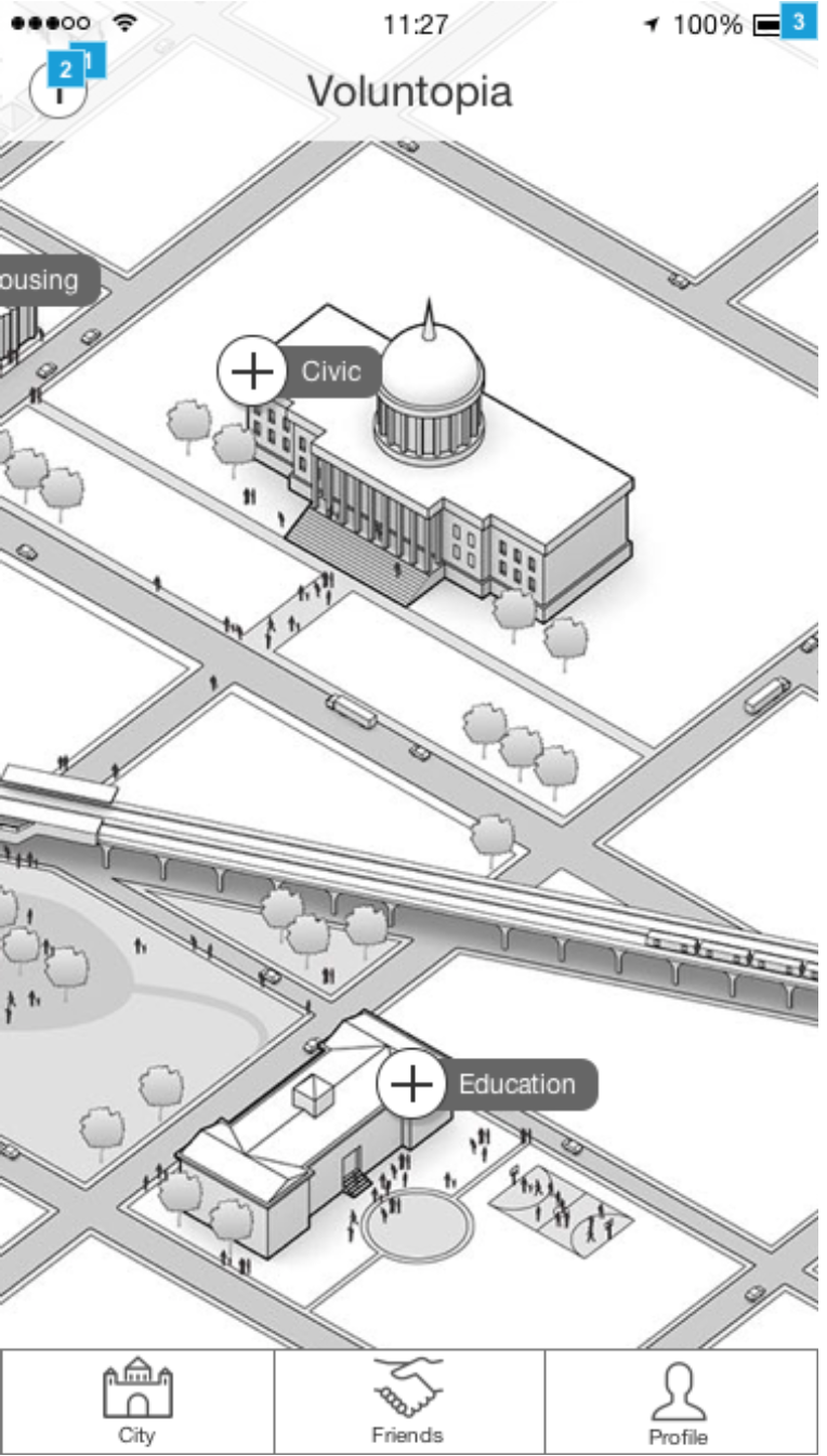
During user testing, the style tile below, designed by my teammate Austin Smalls, gained a lot of important feedback that ultimately steered us to make the decision direction to change some of the wireframes initially presented. During testing, users mentioned that inside Autin's style tile the interactive map for the home screen was unnecessary and also, distracting to the overall goal of completing a volunteer event. Users mentioned, as young busy professionals, that their time is valuable. Rather than gliding one's finger across the home screen trying to search for their desired volunteer event, they mentioned they would've liked to see more of a "type and search" function with filters to help them easily find the interested volunteer events to sign up for.
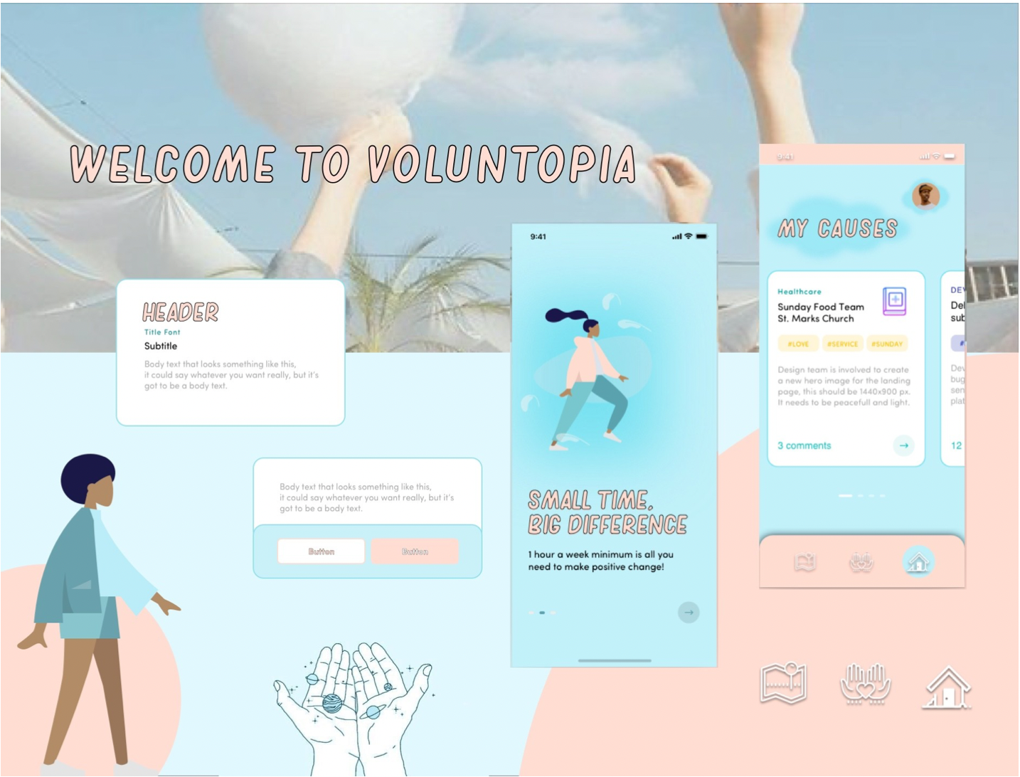
We gained some beneficial insights from desirability testing. To conclude on a design direction, I referred back to my competitive analysis and the style tile which had the most positive reactions/feedback from user testing. Out of my 3 style tiles, style tile 3 received the most positive feedback. 83% of users responded that they could actually see themselves using the application as well as commented the branding resonates volunteerism and reminded them of “Helping Hands”.
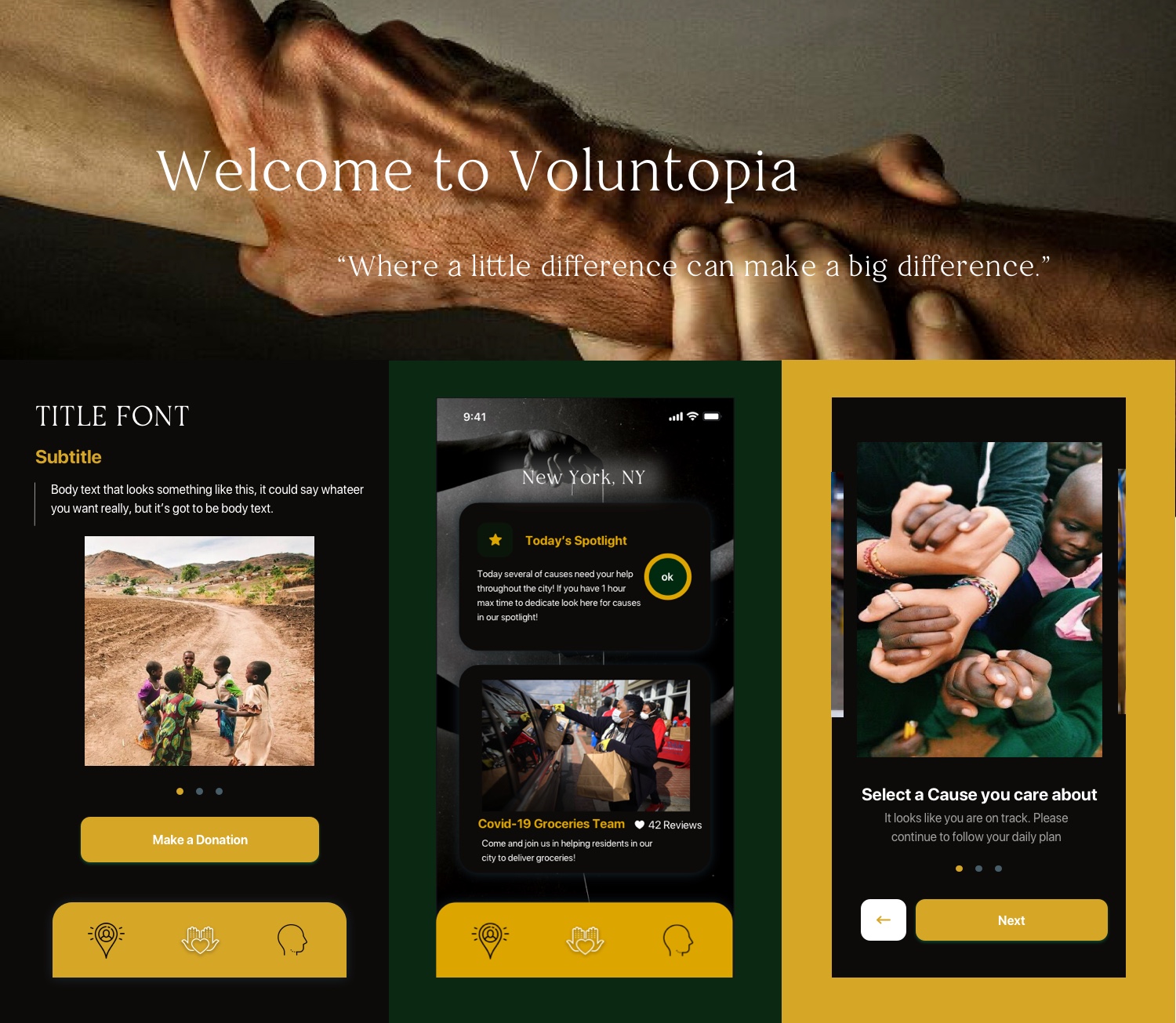
I decided to apply the Helping Hands concept to the initial hi-fidelity screens to resonate volunteerism and use green and gold colors to speak gamification and royalty. By applying this concept, Voluntopia was able to showcase an empowering theme to its branding and also provide a bold identity that gives Voluntopia a serious, yet fun look.
Due to the nature of the project being a mock project, our team made sure to first confirm with our stakeholders (our course instructors) if the UX wireframes we initially received were fixed and uneditable. Once we confirmed the UX wireframes were flexible, our team decided to proceed in incorporating previous user feedback to update the information architecture and layout of the application. This was in order to provide users with a more intuitive and familiar layout, decreasing the learning curve, so more time can be spent on enjoying the content. Understanding Yelp's design components and its usability helped me understand common design patterns, components and ultimately what to incorporate into Voluntopia's updated wireframes so the user can have a more user-friendly experience.
.png)
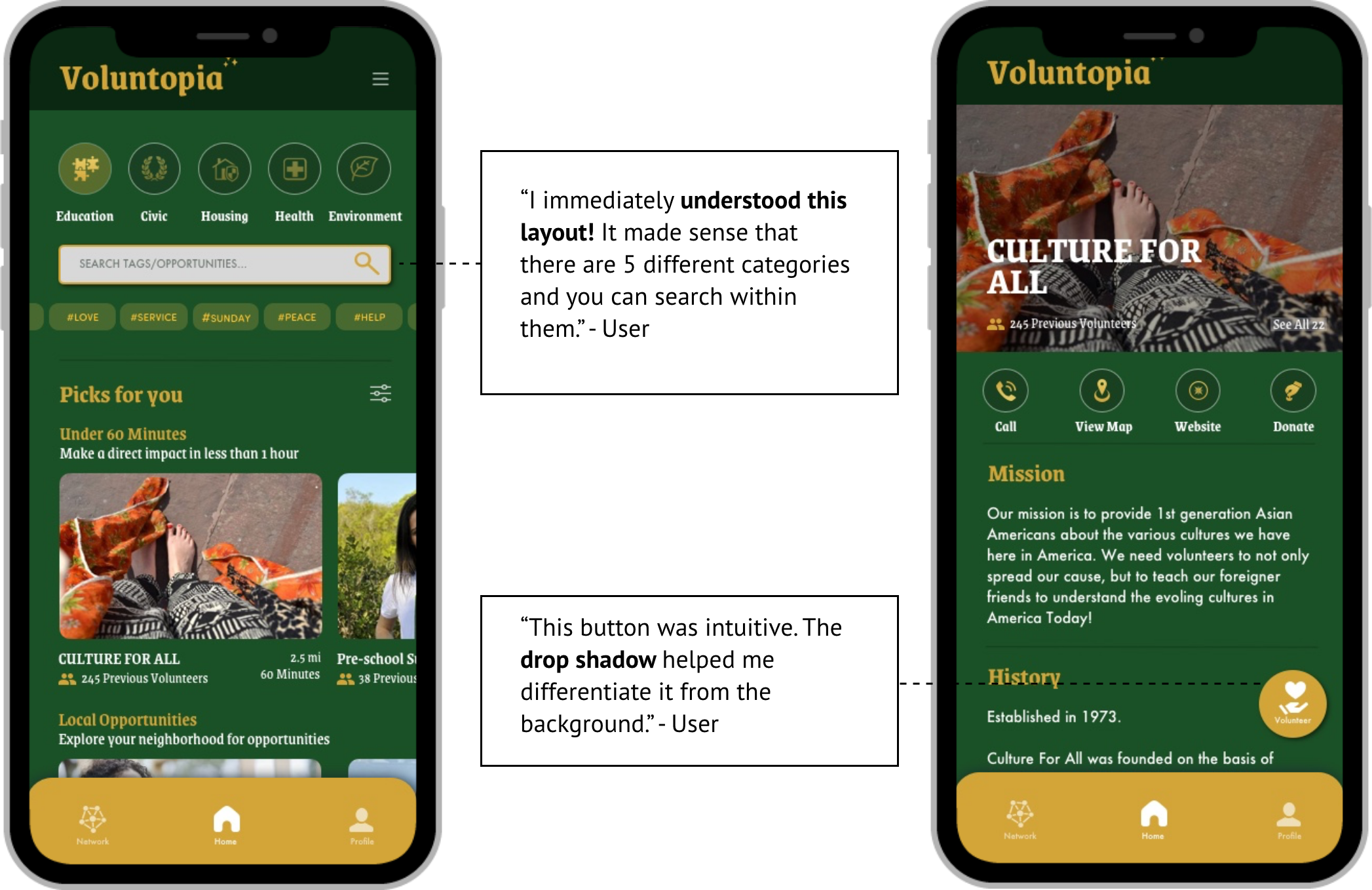
Saves screen real estate and helps categorize the type of searchable volunteer events
.png)
Provides users with the ability to search for interested volunteer events
.png)
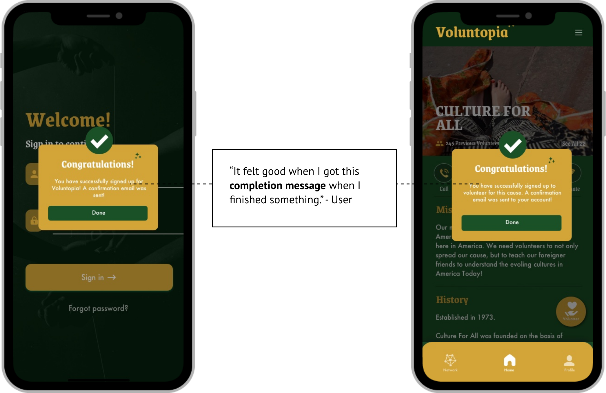
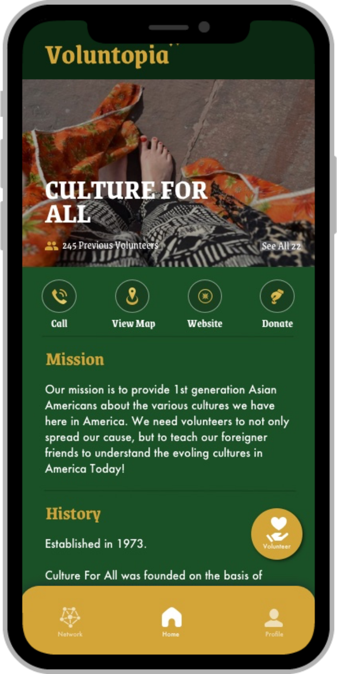
Provides the user functions to call, view map, access volunteer website or donate
.png)
Supports content disclosure and usability by grouping content or information
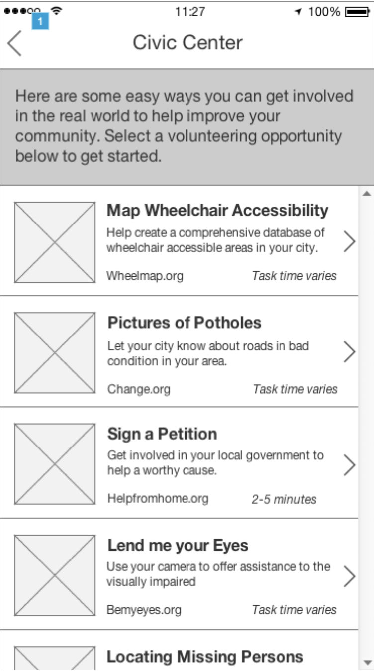
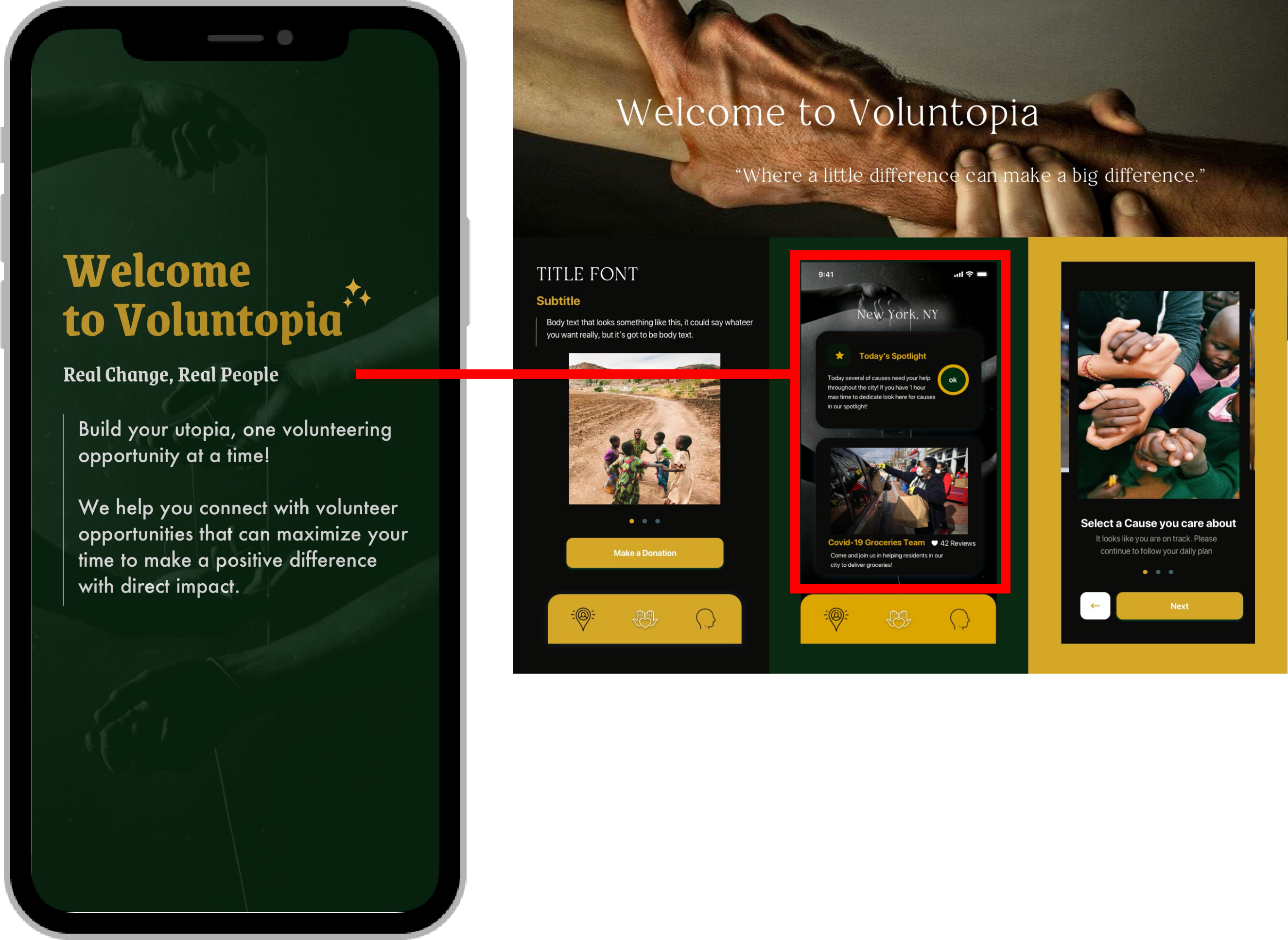
By researching effective UX design patterns as well as applying the insights received from user testing, I proceeded to simultaneously design the newly updated wireframes and then apply the "Helping Hands" theme users from testing preferred the most. Designing from a high level, it was important to first design the main screens for each of the user flows that were in scope. This became our initial designs, setting the start for the rest of the screen designs to follow. Although I kept most of the initial wireframes the same, I believe it was effective to get rid of the interactive map and apply a search bar as well as different categories for the user to select the type of volunteer event desired.
Due to time constraints and the initial scope being far too wide for this round of testing, we were not able to finish designing all the screens initially planned before reaching the initial prototype user testing. Understanding the circumstance, we decided to prioritize this round of testing to cover the first two main user flows. The purpose of this test was to validate whether the branding and theme of the prototype resonated with users and emphasize the theme of volunteerism. We also tested whether users could see themselves using the application.
of users found the new layout more helpful compared to the interactive map
of users found the prototype intuitive from using other daily popular apps
of users were able to complete
the tasked user flows and overall user testing

After testing, we quickly collected feedback, analyzed and continued to design the rest of our screens for the final two user flows for our final prototype. We tried our best to incorporate what was learned from the previous round of testing, but it was inevitable we were running out of time. In response to the amount of time we had to work with, I prioritized finishing the rest of the designs for the last two user flows that remained instead of iterating on lower level details from testing feedback. Although iterations are incredibly important, I wanted to focus the rest of my work time on the bigger picture.
User Friendly Interface
.png)
Connection and Gamification
.png)
Visibility and Structure
.png)
Having a better understanding of the app's usability helped me to refine the designs of each screen that would help the user to achieve his/her task easier based on the primary user flows that were in scope. The refinements for each designed screen made more sense as I was able to imagine what it would be like to use the app from a user's perspective. Below are some of the major refinements that were highlighted as part of the final designs.
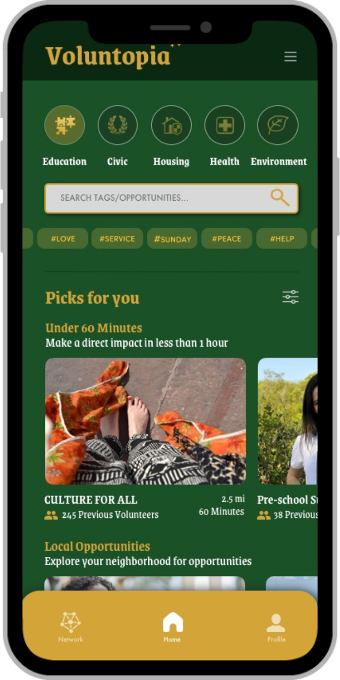
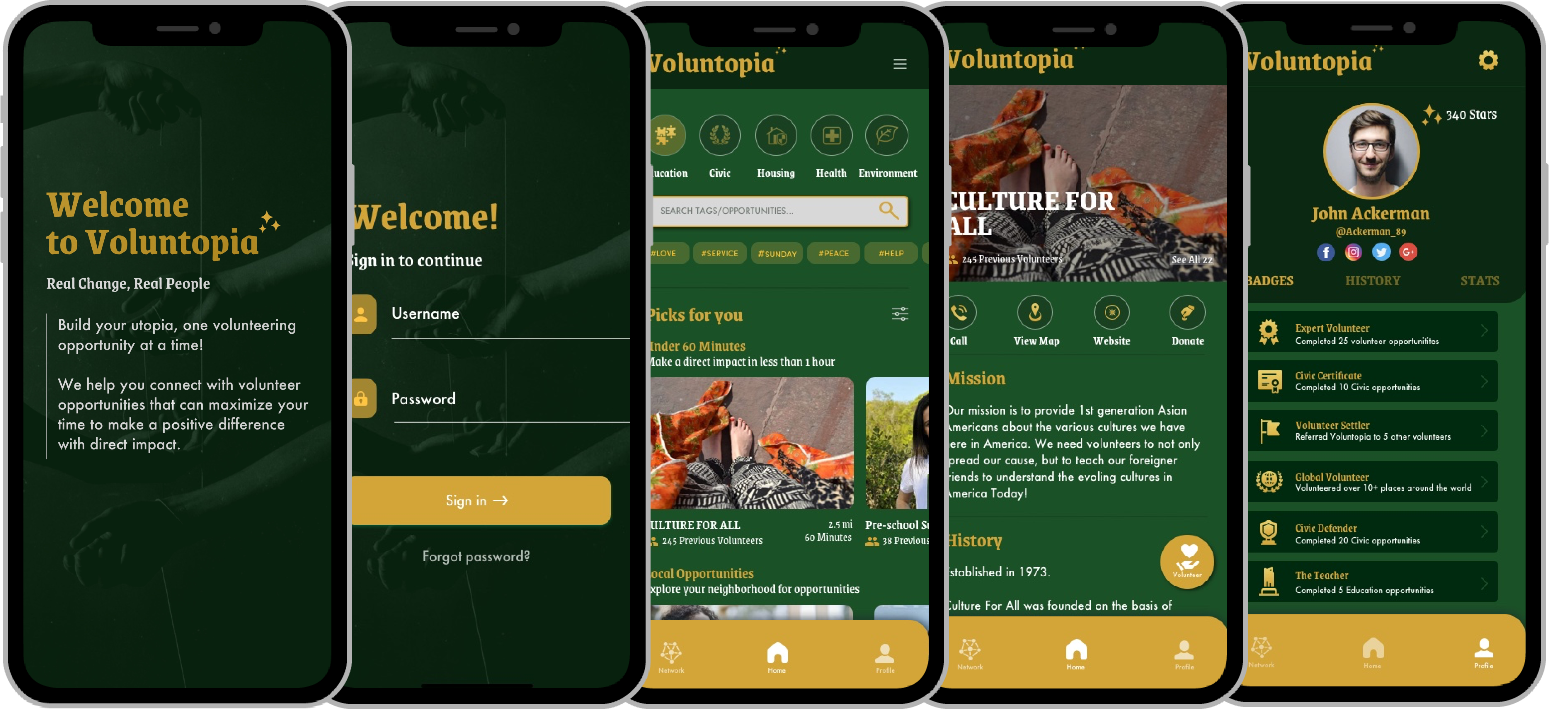
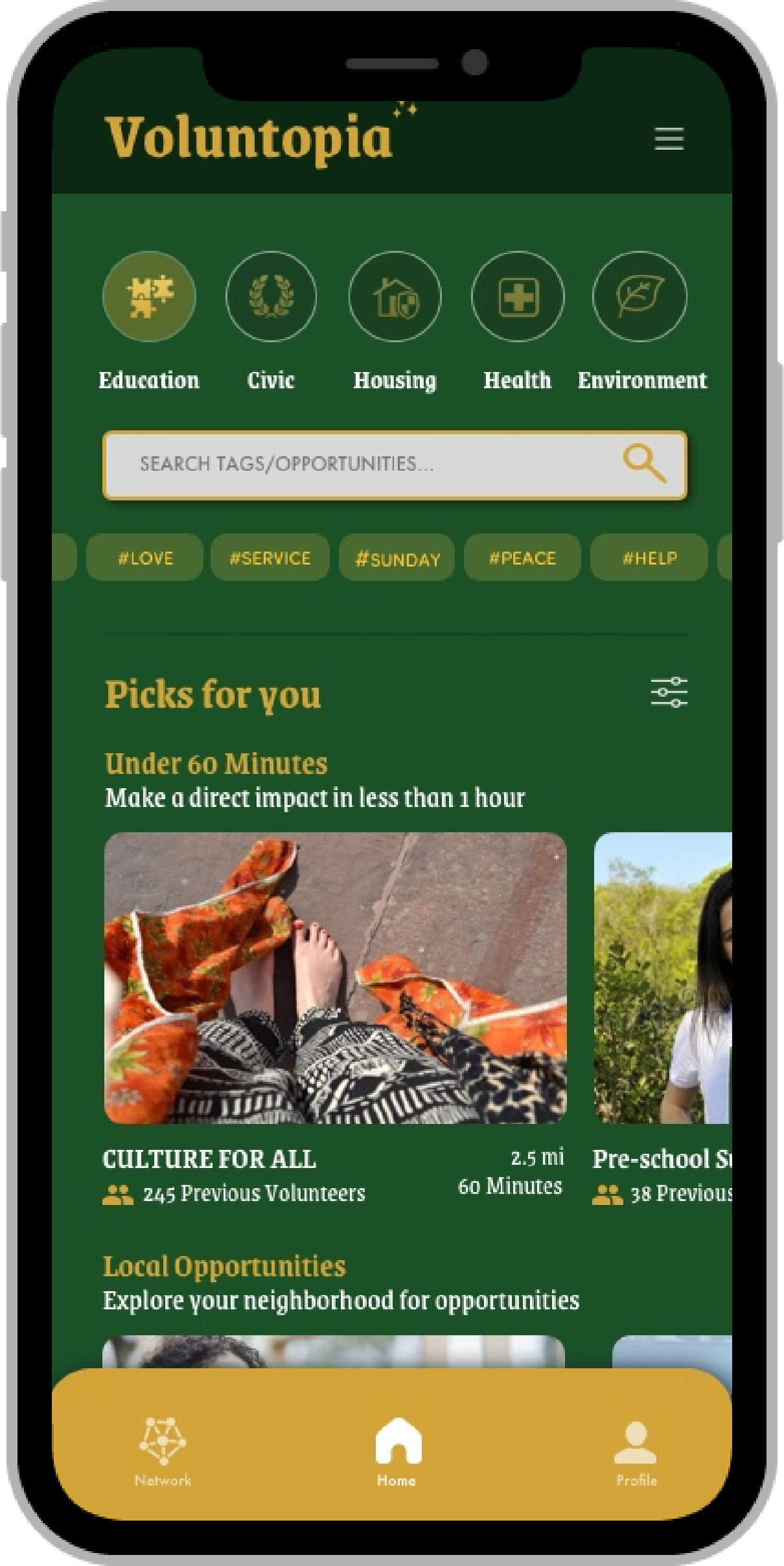
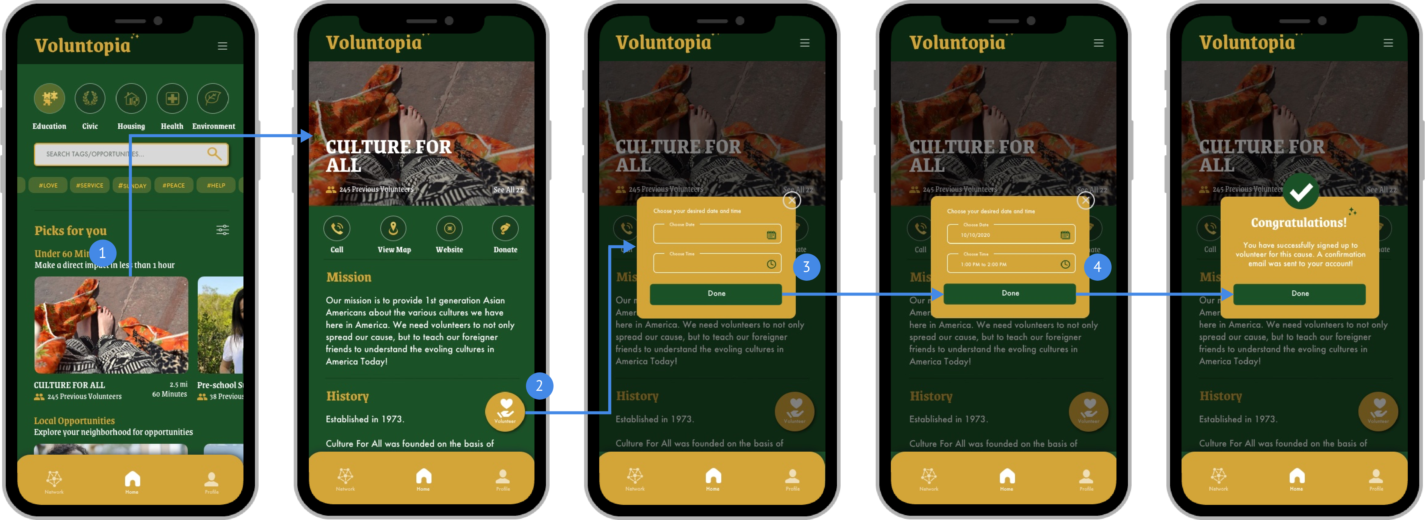
By redesigning the initial wireframe of the home screen, I wanted to provide an easier way for the user to search for volunteer events and give more control to the user
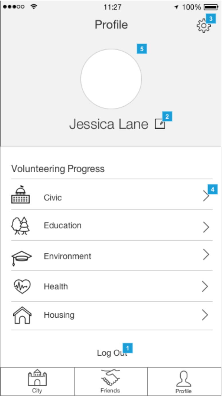
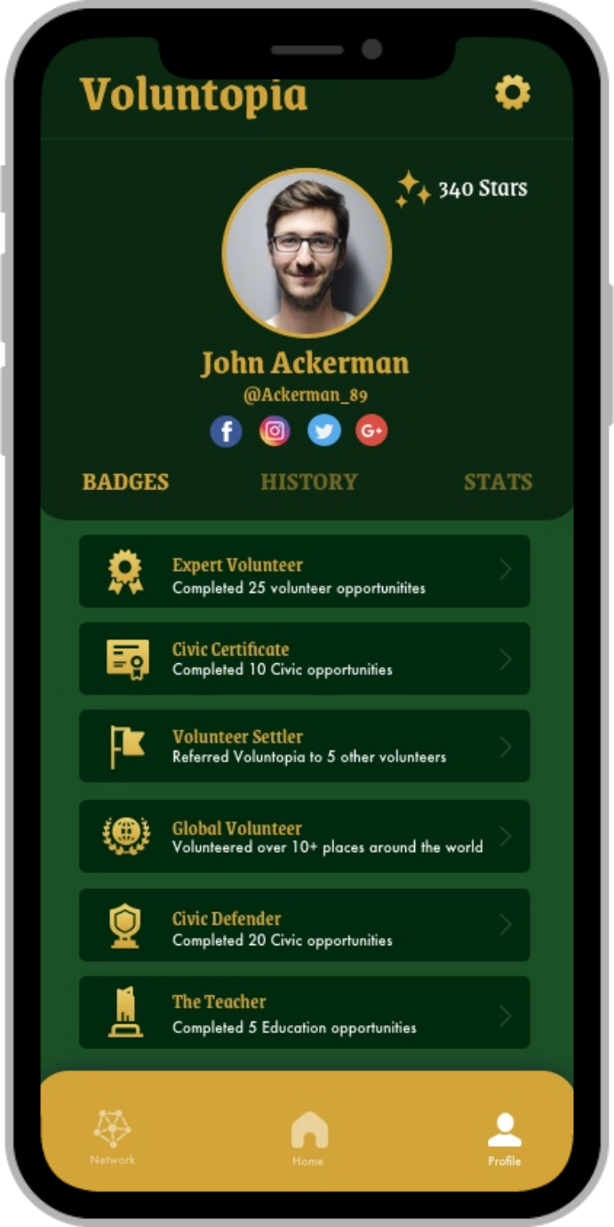
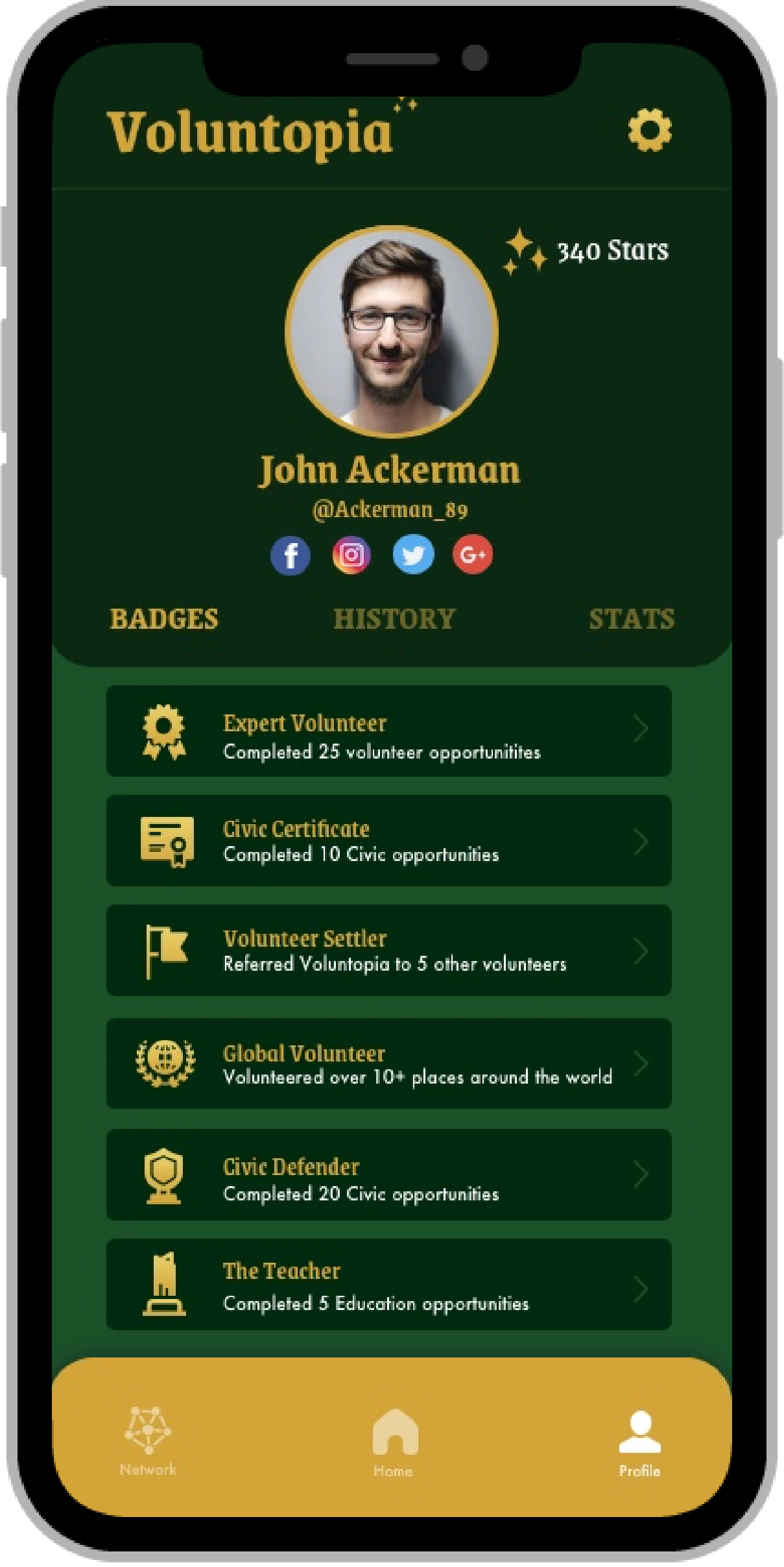
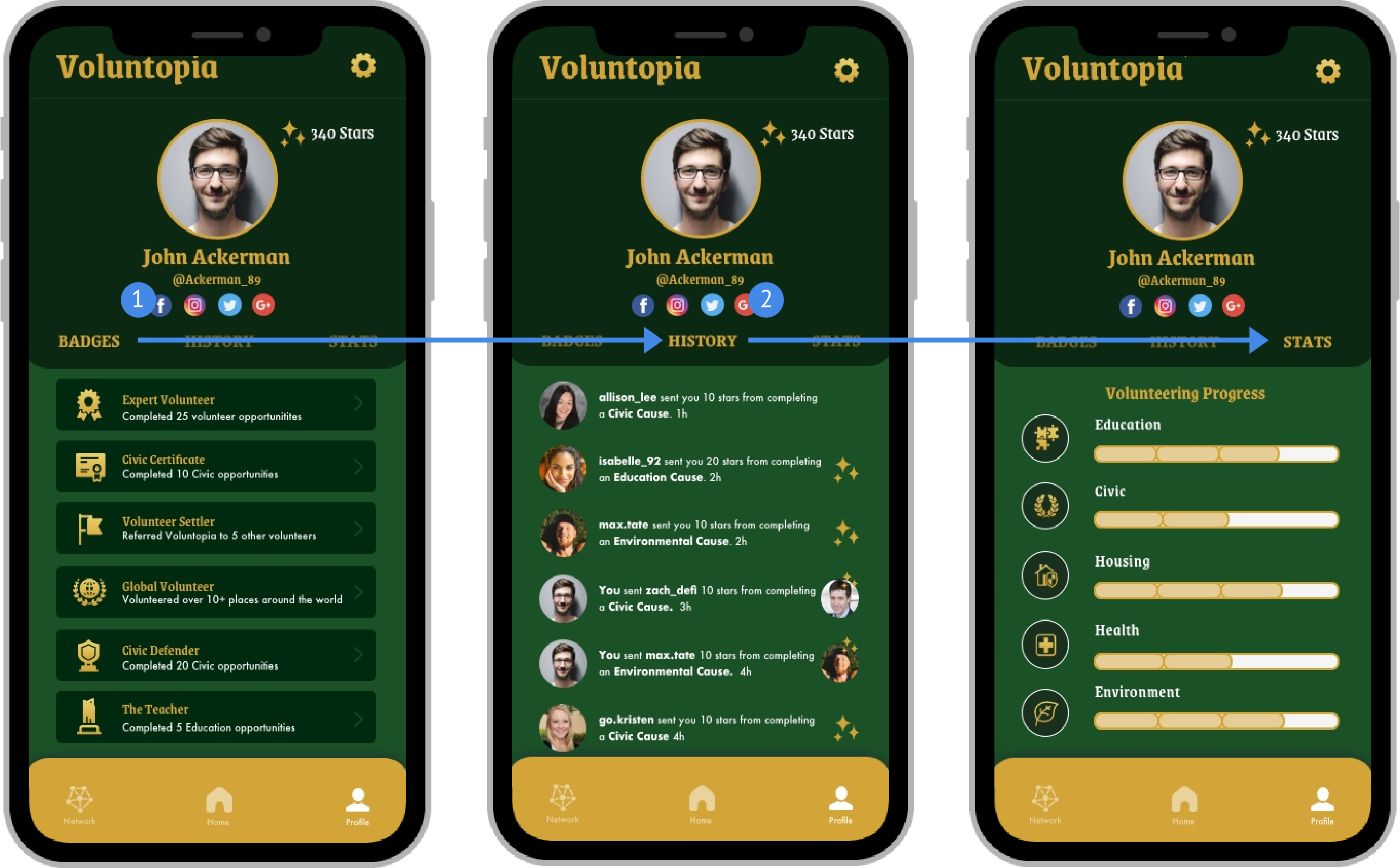
Adding tabs to the initial wireframe provided the profile view to provide and disclose more information about the user such as Badges, Social History and Stats
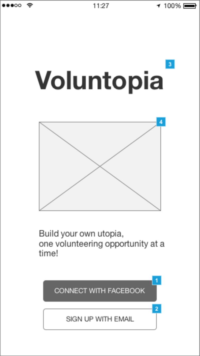

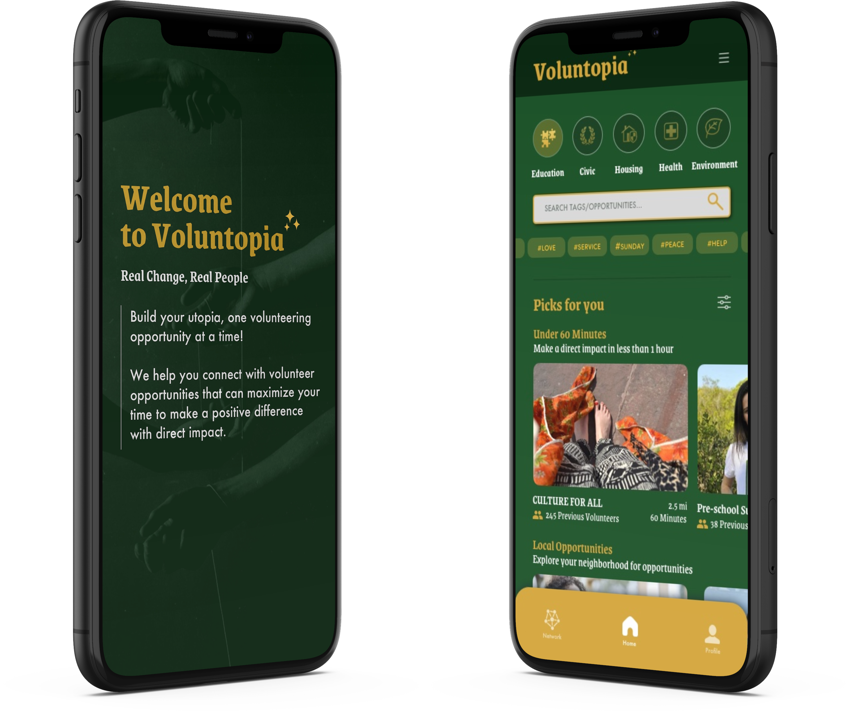
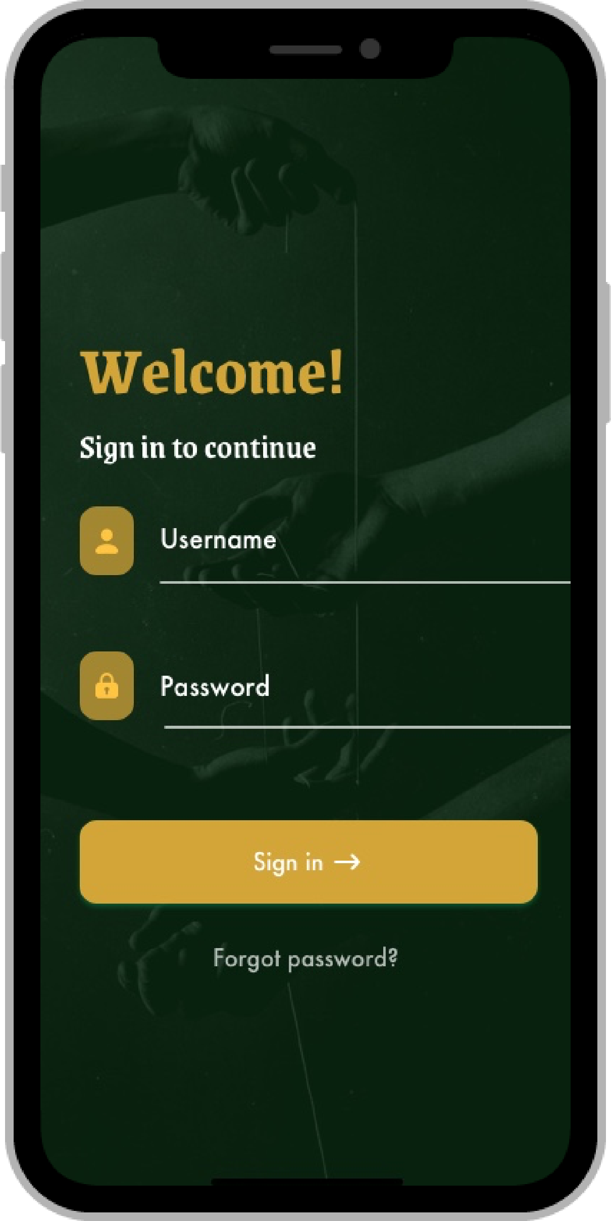
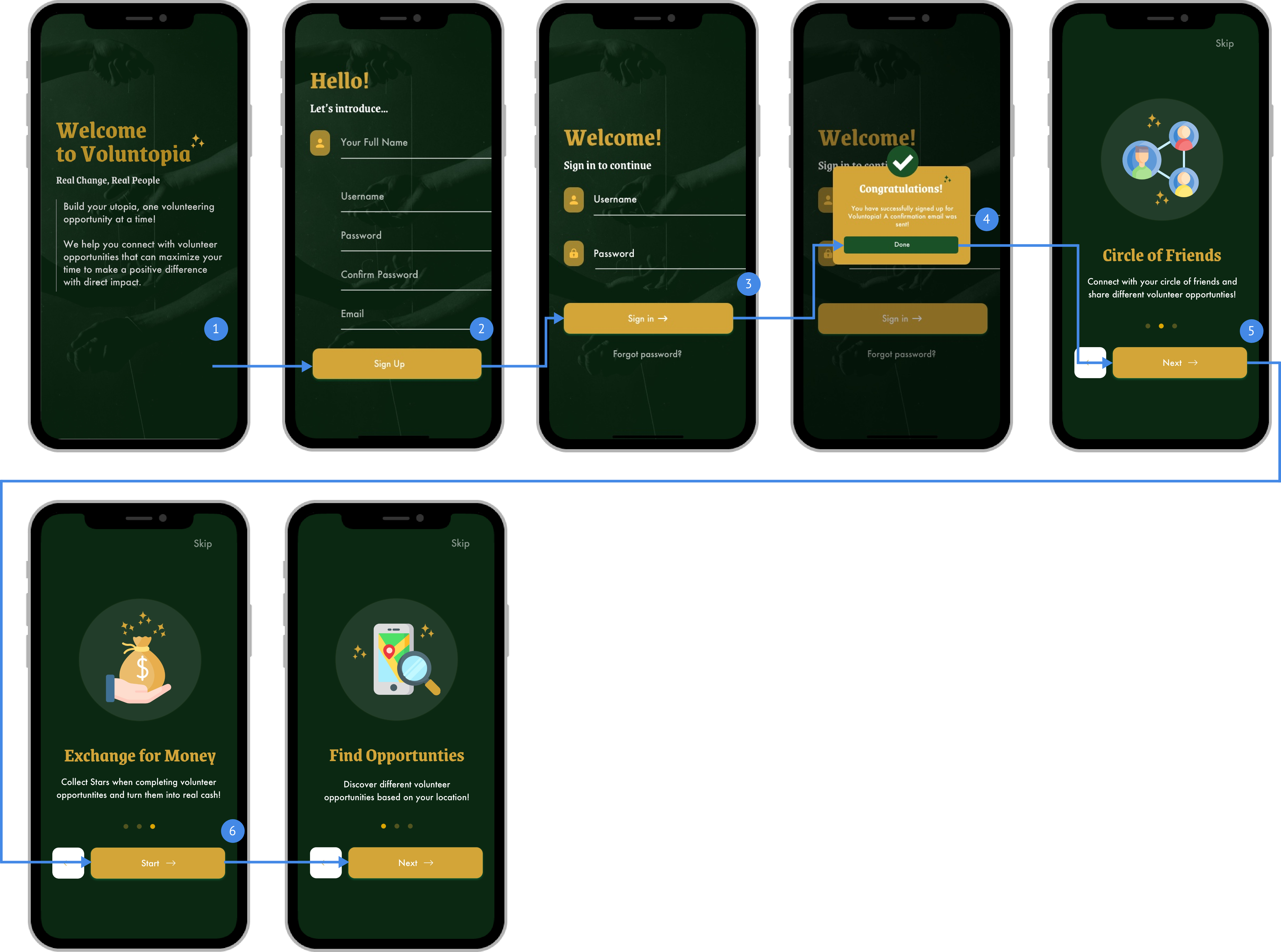
Applying the "Helping Hands" theme with an approachable green and yellow color scheme helped give the Login screen a simple yet, exciting design

Due to time constraints, I did not finish the UI design for this wireframe, but I was able to complete the design for the screen if a user selected one of the options
A fight against time, we focused on finalizing our hi-fidelity screens according to the main user flows that were in scope based on the client's existing wireframes. I broke down my final prototype in four different user flows to see each functionality in use. The user is able to sign up, login and go through the onboarding process to reach the home screen. The home screen no longer showcases a map to find one's volunteer event, but a type and search function was instead applied to give the user more power and ease to search various volunteer events.
.gif)
.gif)
.gif)
.gif)
Through testing and research, we found having a bottom navigation bar helps the user easily access the main segments of the application. This will need more testing as Sustaio continues to build the application.
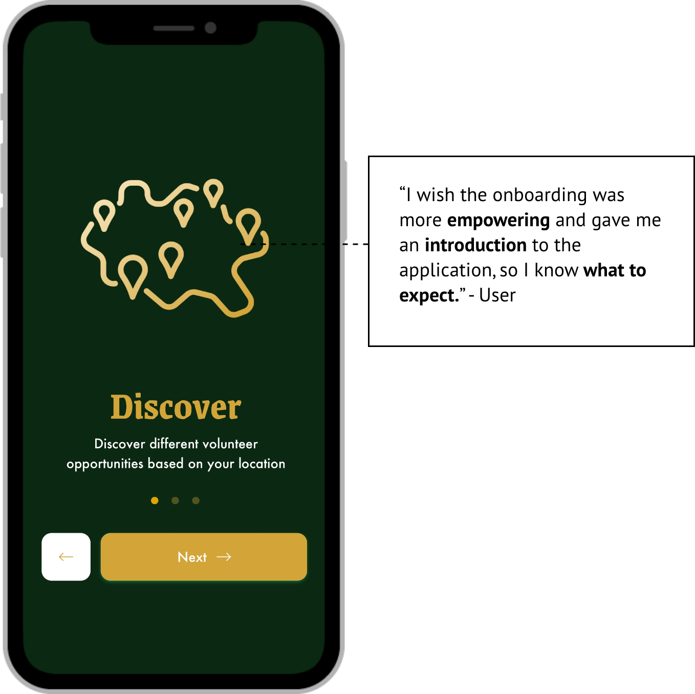
Users mentioned they would have liked a more personalized onboarding experience. Onboarding should ask more about the user's background and use the data to calculate the user's Sustainability IQ as well as daily consumption levels.
Through testing and research, we found having a bottom navigation bar helps the user easily access the main segments of the application. This will need more testing as Sustaio continues to build the application.
Looking back, we assumed that everything would run smoothly. We were eager to begin designing as fast as we could as we wanted to surprise our clients with our designs. Blinded by our naiveness, we failed to set the project timeline as well as expectations that would've helped guide us make key design decisions throughout the project. Without agreeing on a project roadmap, our team struggled with prioritizing our design time and thus caused us to use the majority of our work time focusing on minor details instead of the bigger picture.
As a young designer, I was ready to get my hands dirty as soon as I dived into Sketch. I ended up using a lot of time pushing pixels and making sure margins and positioning of design components were the same across all screens. Through these manual labor intensive exercises, I realized that there are many resources and shortcuts to UI/UX design that is able to speed up the design process. Many mobile applications use very similar design patterns, components and trends that are also constantly changing. It is important to keep up with design trends and obtainable resources, but also keeping one's integrity as a designer by applying one's creativity.
It's easy to get caught up in the details and I saw this within my own design process. Getting caught up in the details can be a dangerous rabbit-hole. One of the more important lessons that I learned from this project was to focus the design process from high level to low, simply meaning to lay a nice base design first and comeback to the details later. This will help prioritize certain steps over others and hone in our focus on more of the concept rather than get lost in the small things.